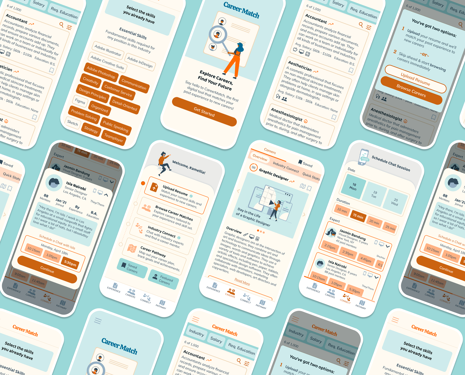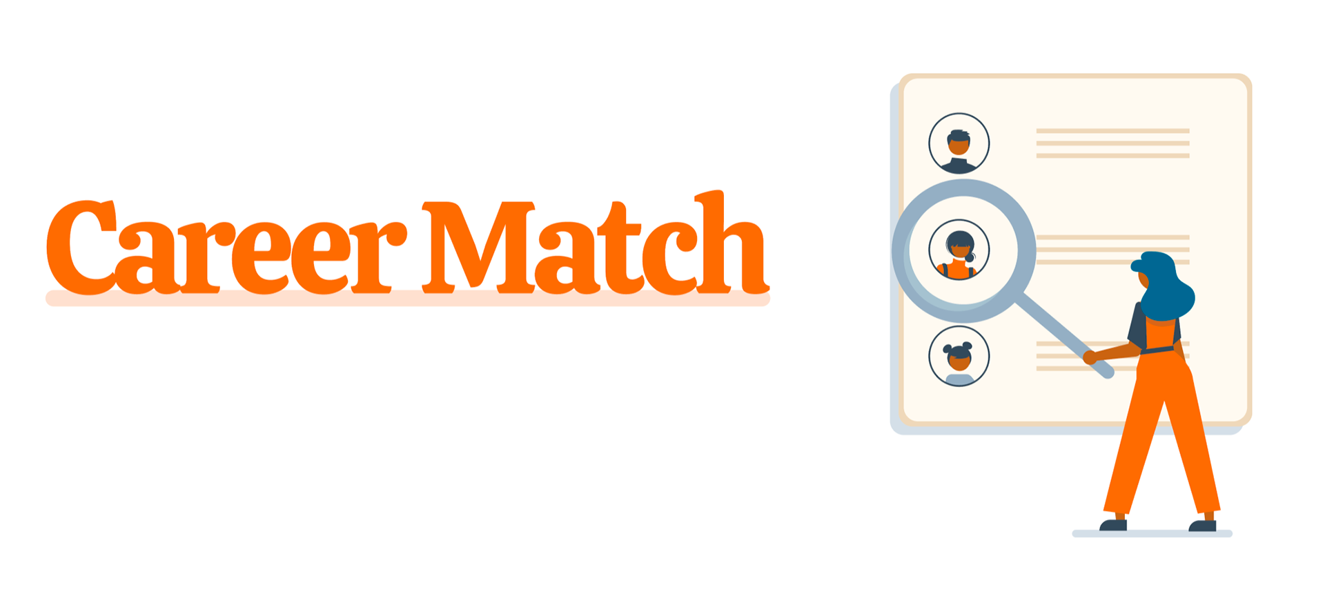
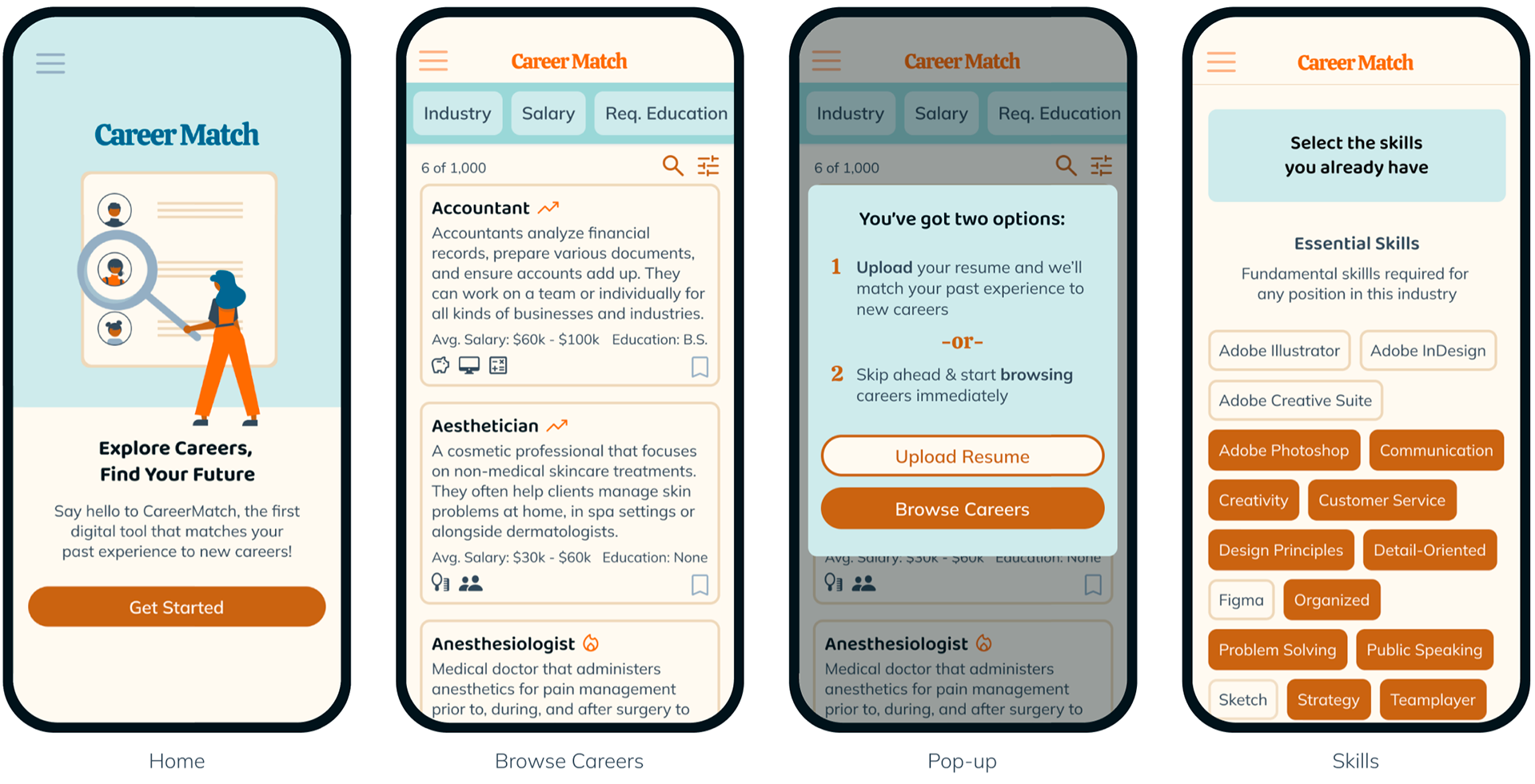
App
Final mockups for dedicated mobile app
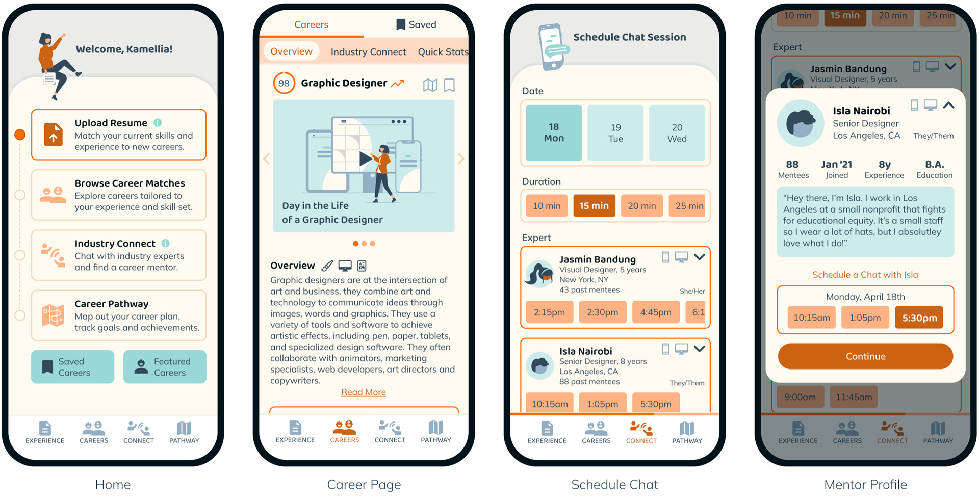
App Prototype
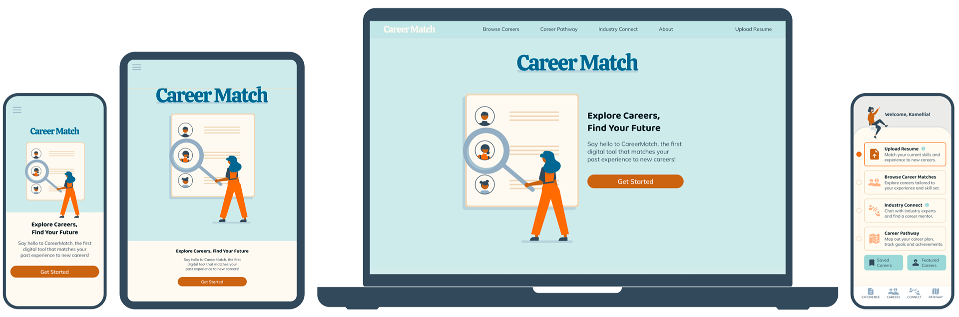
Website
Final mockups for desktop website
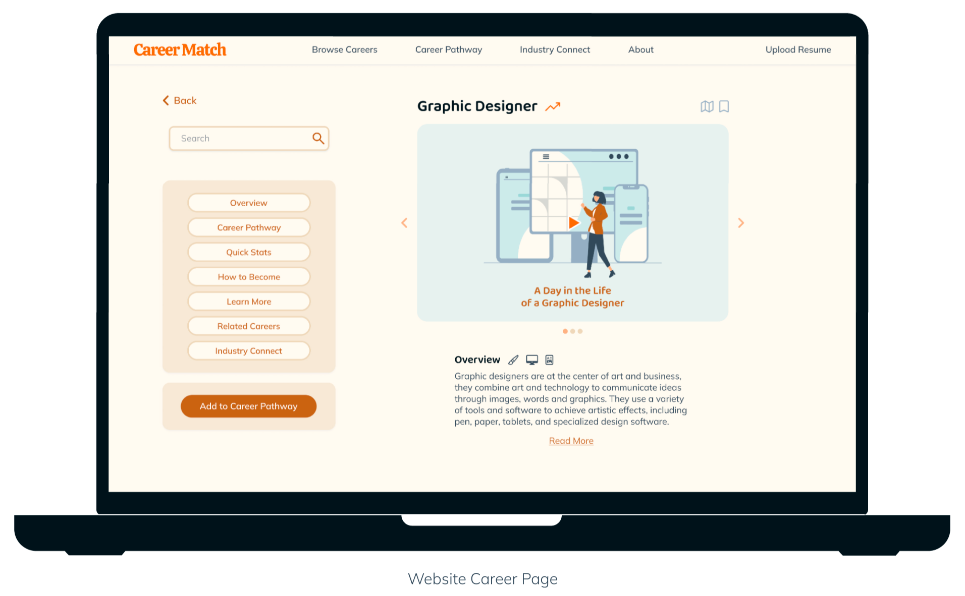
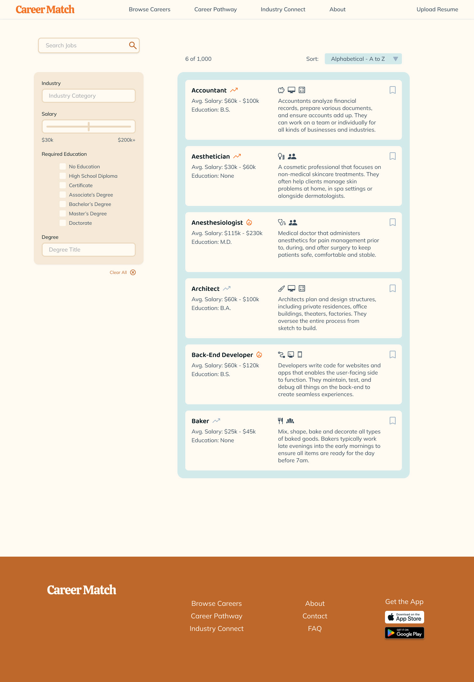
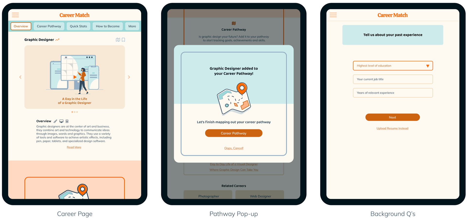
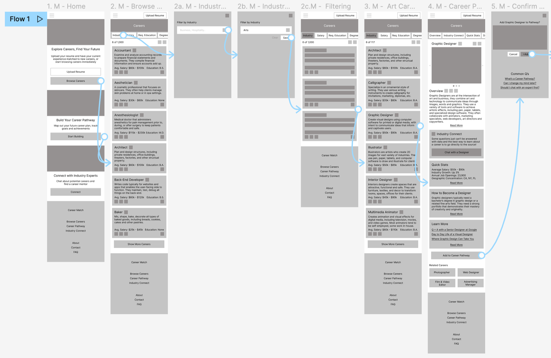
Browse Careers
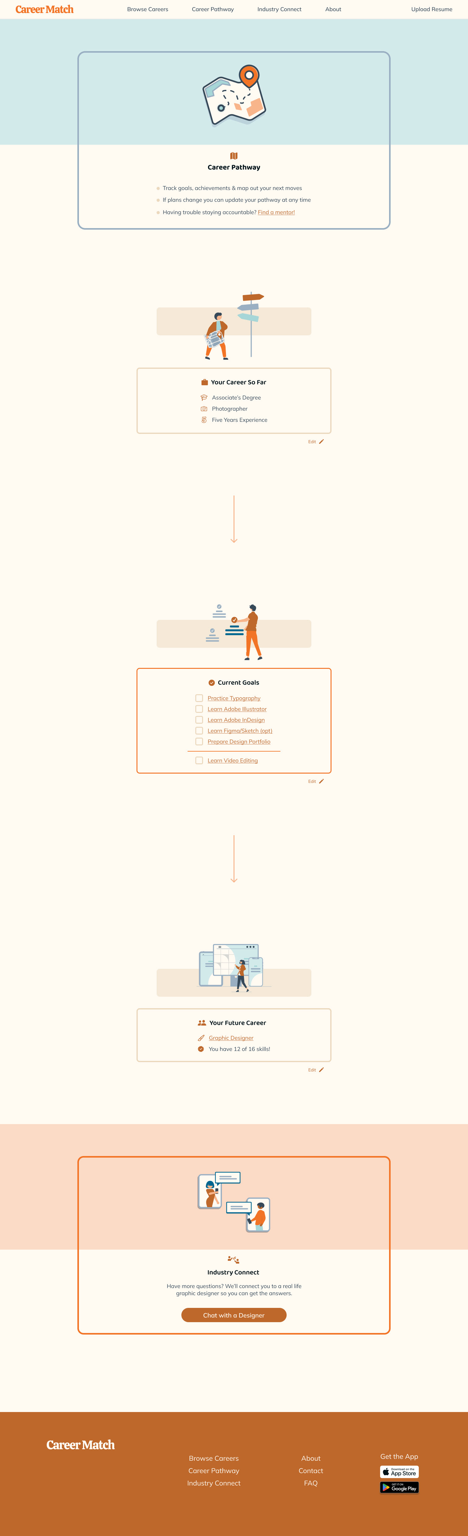
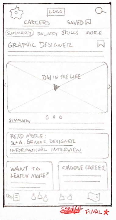
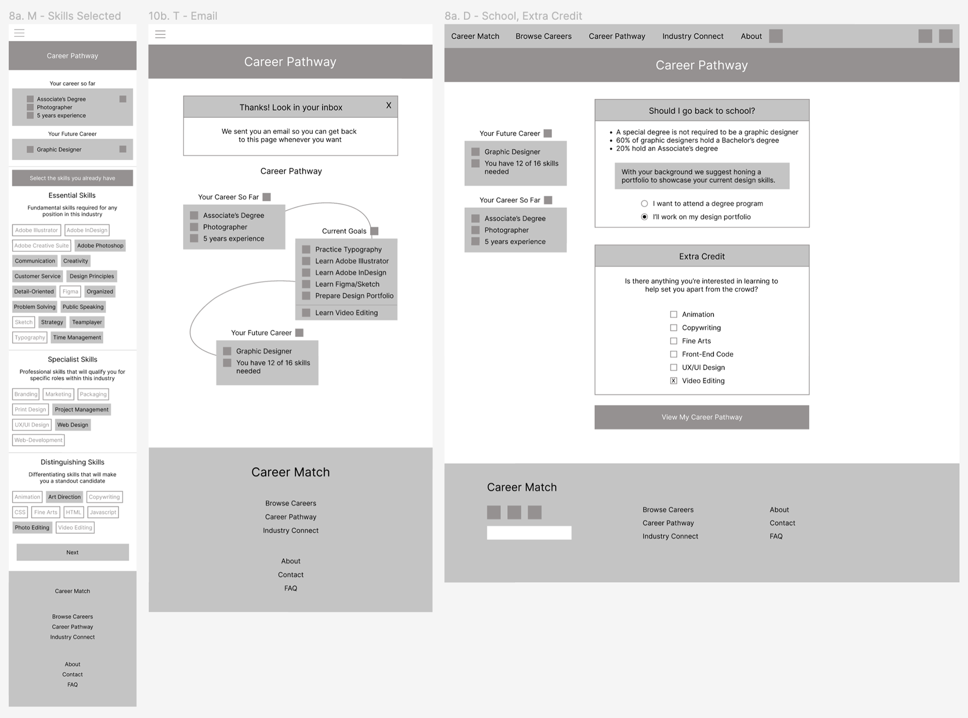
Career Pathway
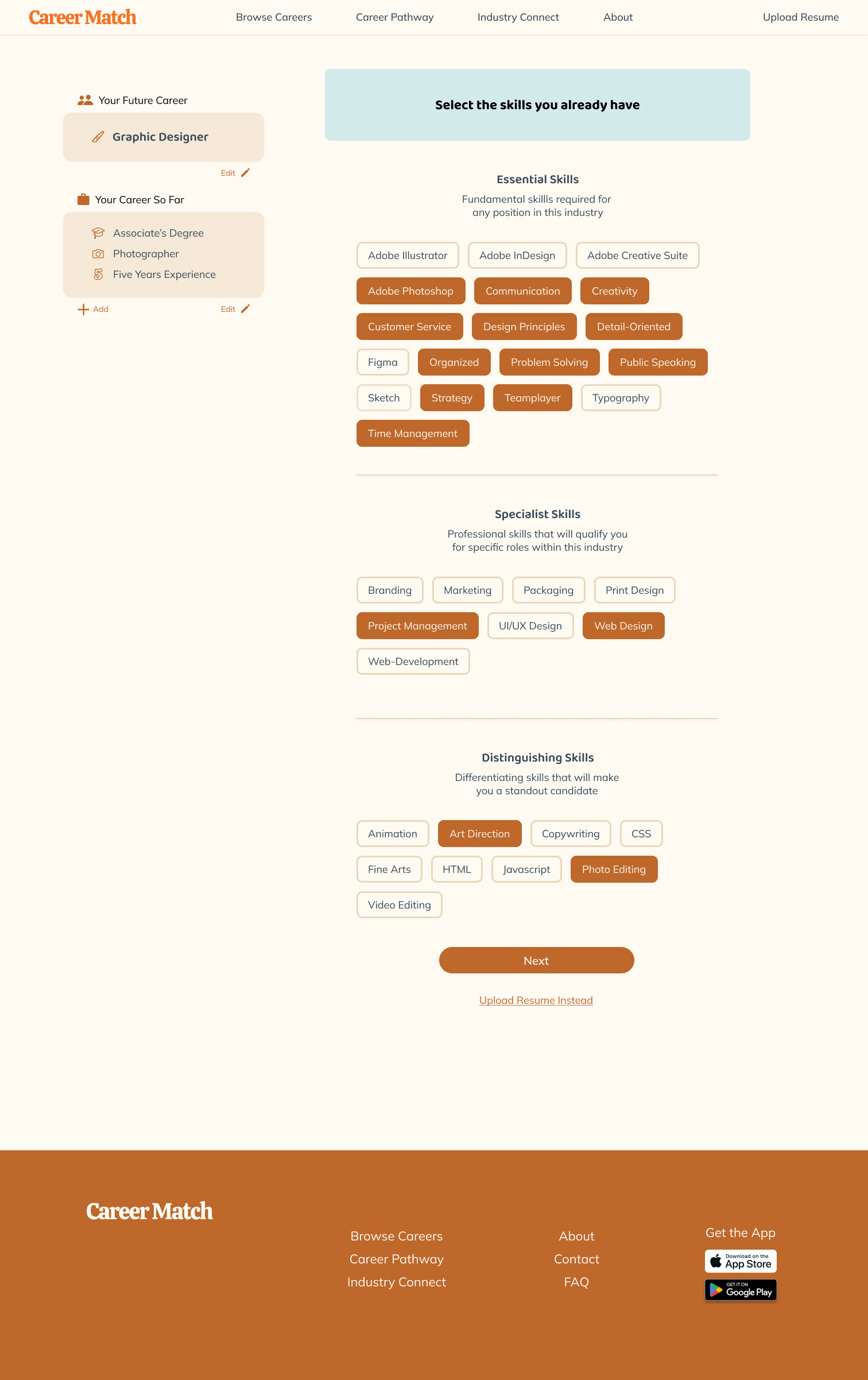
Input Current Skills
Website Prototype
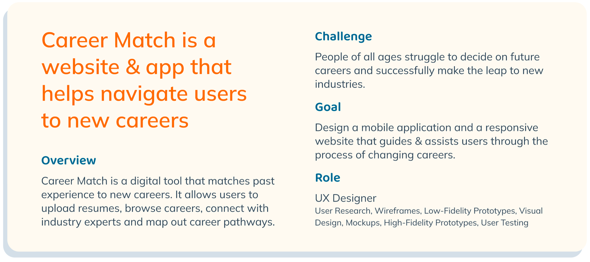
Understanding the User
Getting Started
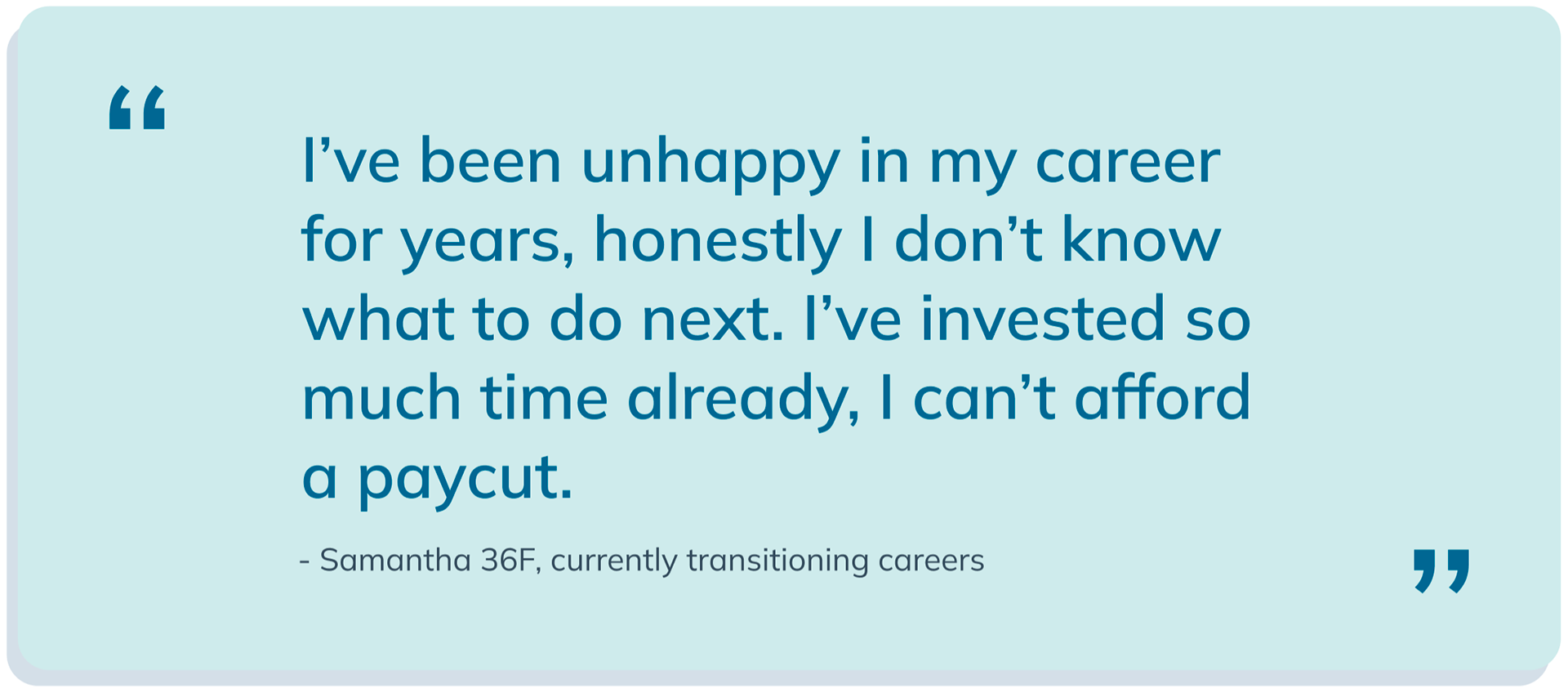
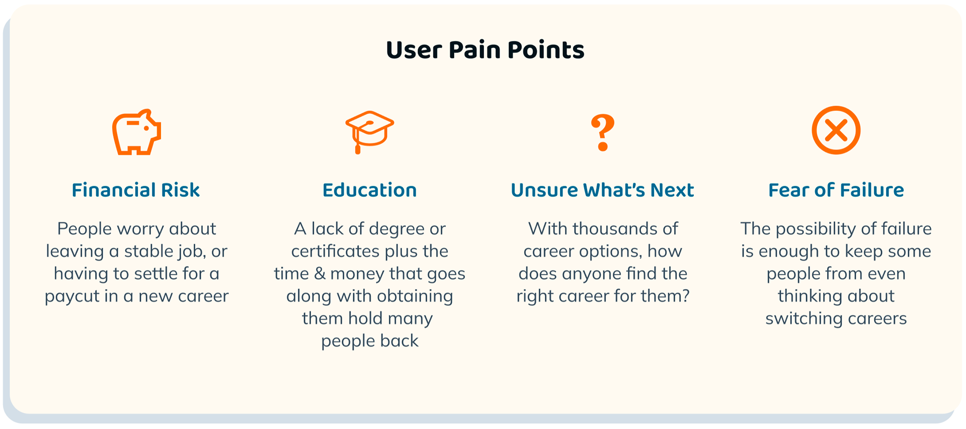
It's safe to assume we've all been there at least once, working a dead-end job or finding our workplace no longer suits us. Once you've taken notice of your discontent, what's to be done? How do you figure out what's next, how do you get there?
User Research
I started my research by interviewing six users. "Have you ever changed careers?" I asked, everyone said yes. When I asked how they did it, the answers became less clear. Most users reported knowing they wanted to change careers for a long time before they even started the process, but also remarked they were unsure what they should do next.
What's keeping people from leaving their current careers in pursuit of happier, greener futures?
Finding the Target Audience
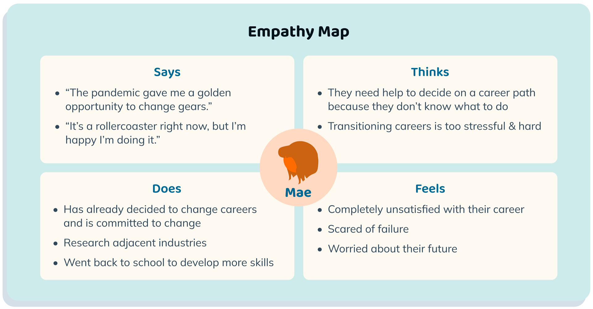
I needed to determine the users I was designing for, so the first thing I did was chart the interview responses on empathy maps. This showed me there were actually two distinct users, which I further developed into personas: Mae and Cane.
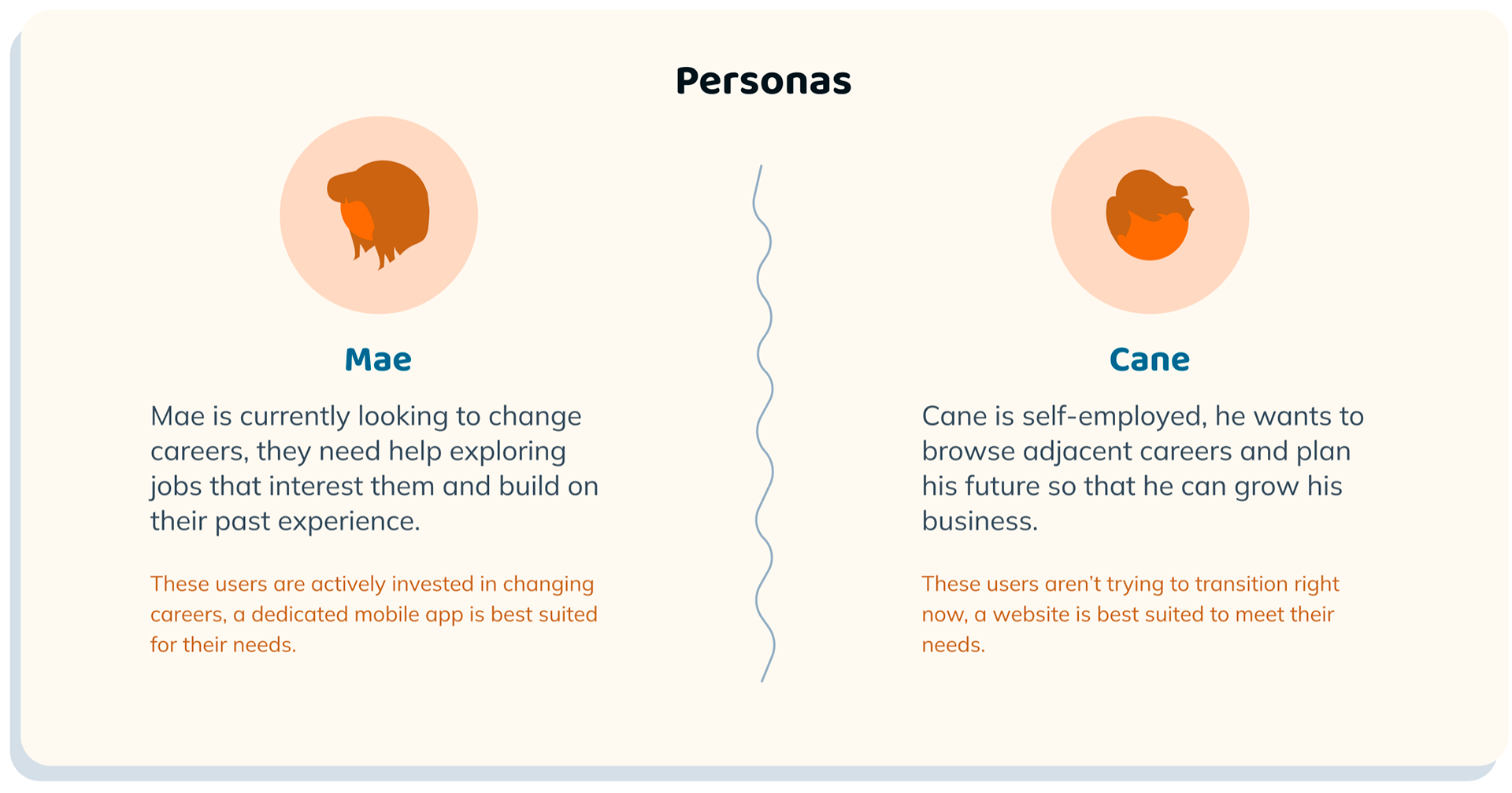
What started to become clear was two products were needed to satisfy both user bases. Users that were already dedicated to switching careers, the Mae persona, fit into a dedicated mobile app to best meet their needs. The Cane persona, were users that were not currently looking to transition, so a responsive website seemed most appropriate.
Starting the Design
Wireframing
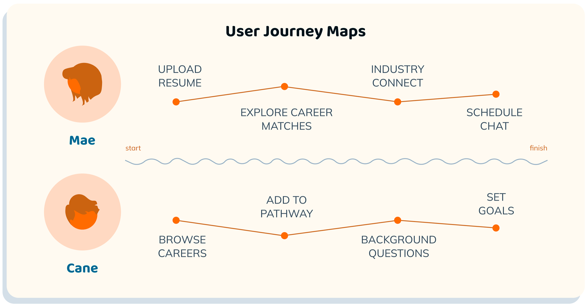
The first step was to sketch wireframes. Every screen was drawn 5 times and then refined into final versions that collected the best elements. From there I used Figma to recreate those final sketches into digital versions and connected them to make low-fidelity prototypes of both the app and the website.

App Upload Screen

App Resume Confirm

App Browse Careers
App Career Page
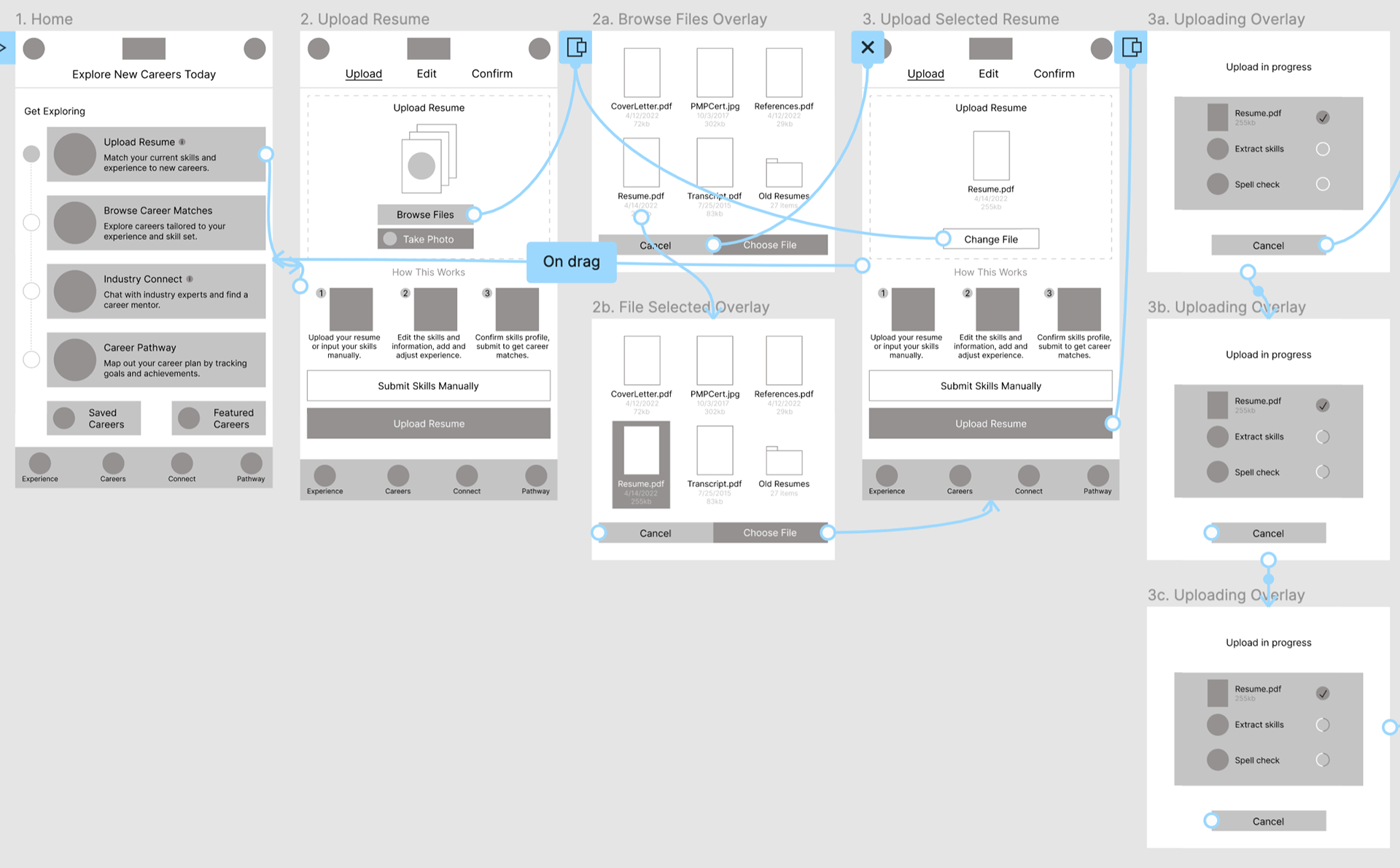
App low-fidelity prototype
Website wireframes designed for mobile, tablet & desktop
Website low-fidelity prototype for mobile
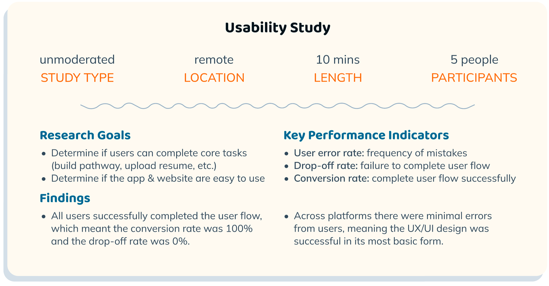
UX Research Study
With the low-fidelity prototypes I set up a UX Research Study to check the functions of the app and website. It was really important at this stage to make sure users could easily navigate the products and perform core tasks. Users confirmed my assumptions and were successful at following the user flow through to the end.
Designing the Brand
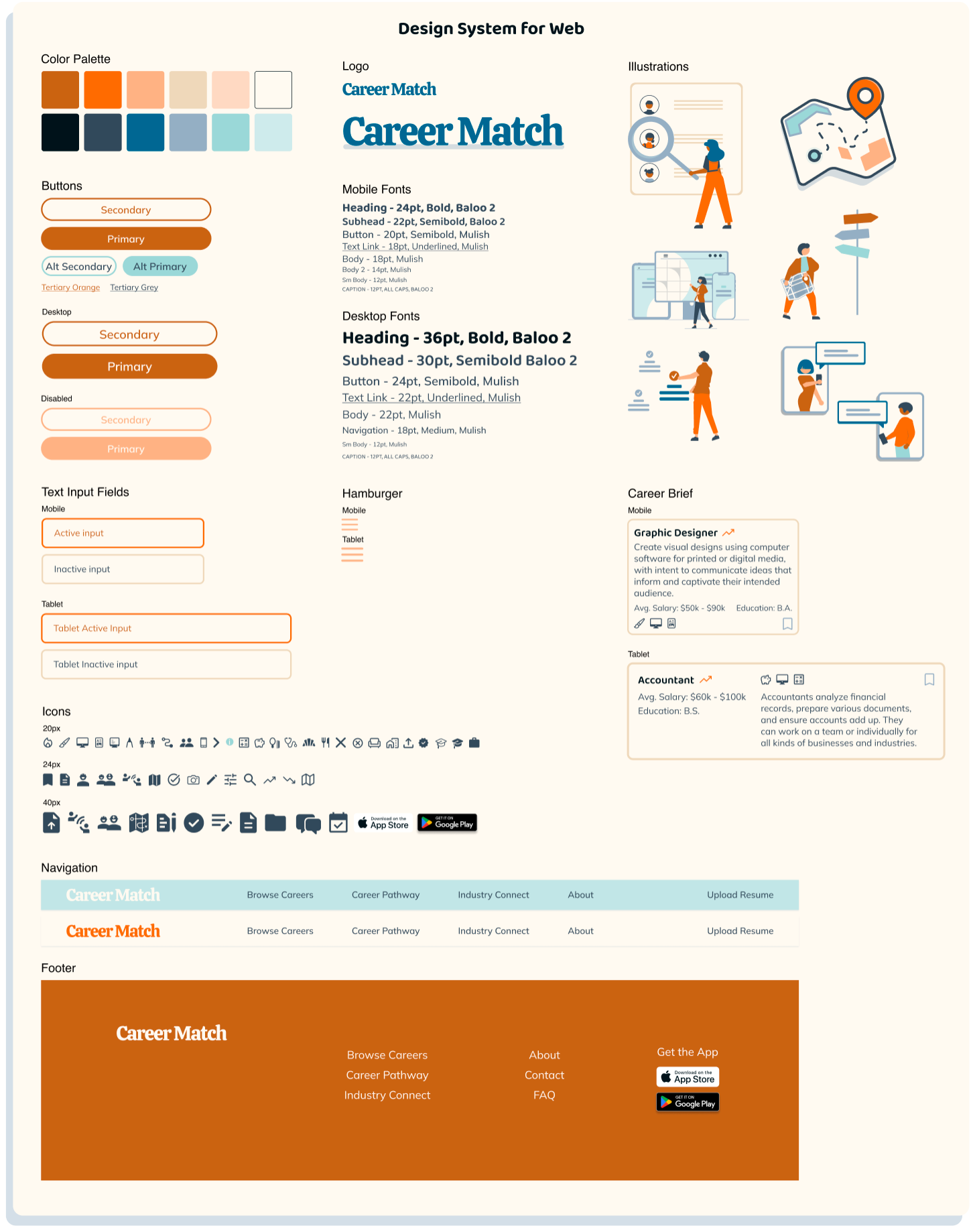
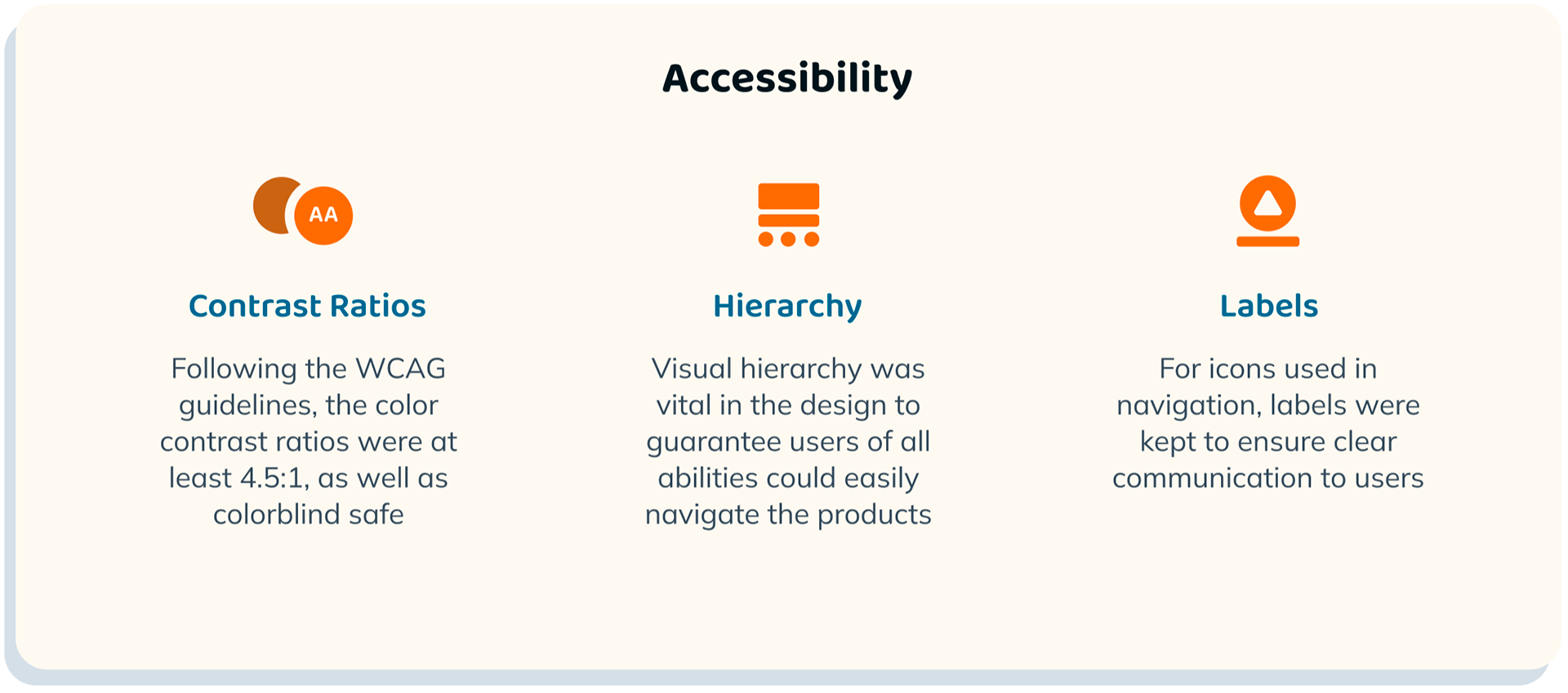
The design of Career Match needed to be vibrant and approachable, otherwise no one would want to use it. I started by choosing the brand colors and then matching a couple sans-serif fonts to help speak to the users. Instead of the static, corporate feel of photographs, I decided illustrations fit with the brand best. Rounded corners replaced sharp edges, grey replaced harsh black, and a soft cream blanketed the entire background. I set up a design system to keep things consistent and easy to build out across multiple platforms.
Mobile Web Mockups
Final mockups & prototype for mobile website
Tablet Web Mockups
Final mockups & prototype for tablet website