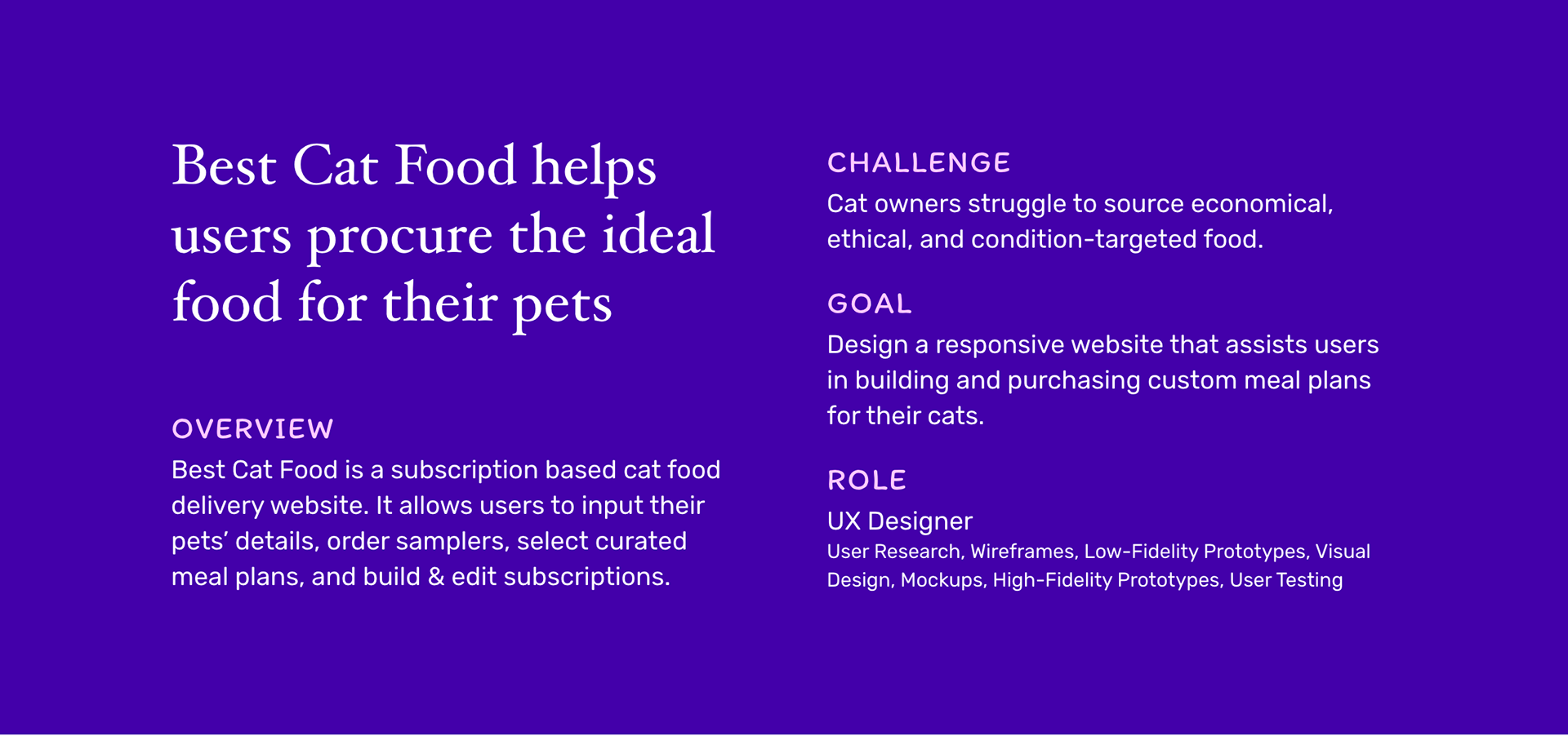
Website
Final mockups for desktop website
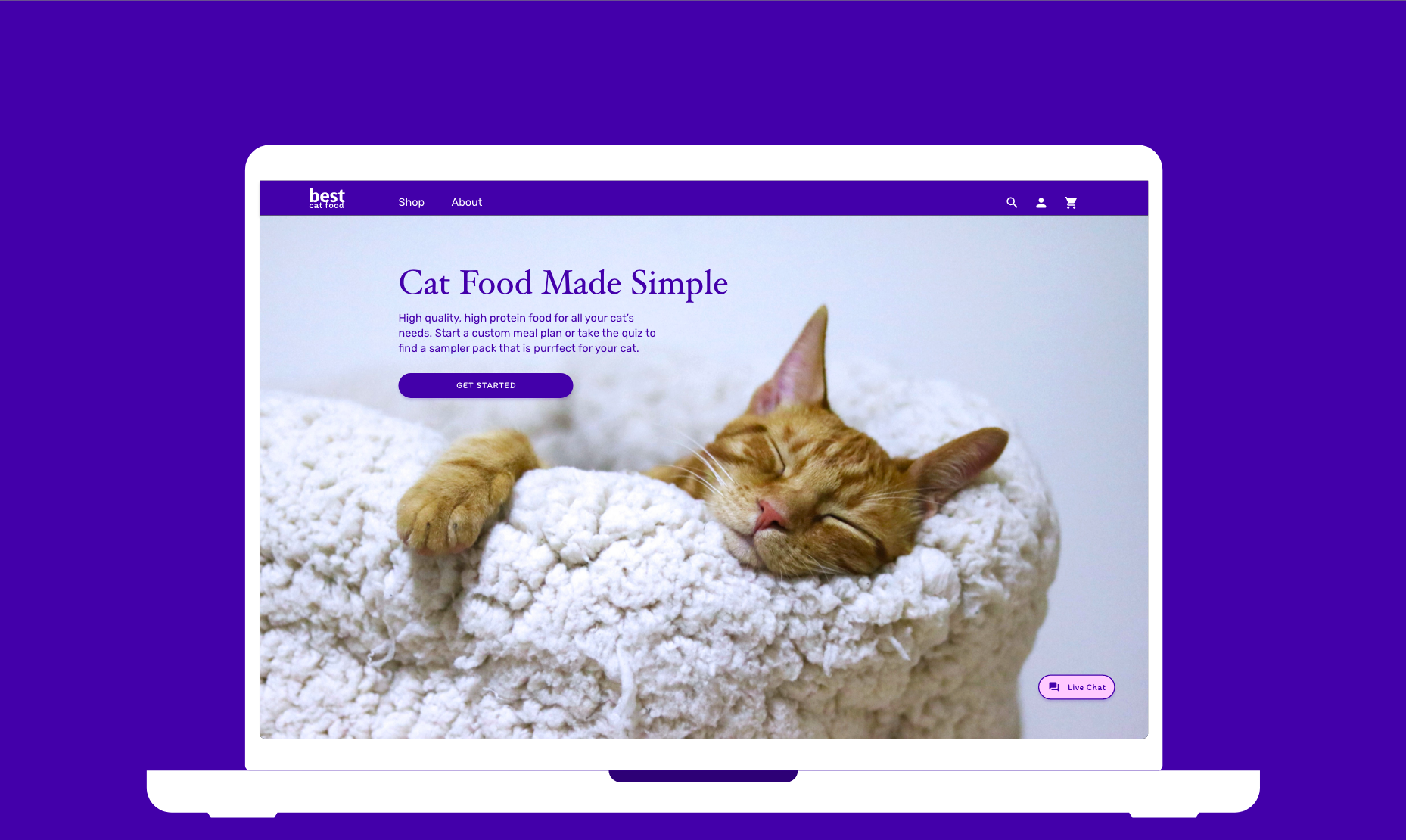
Home
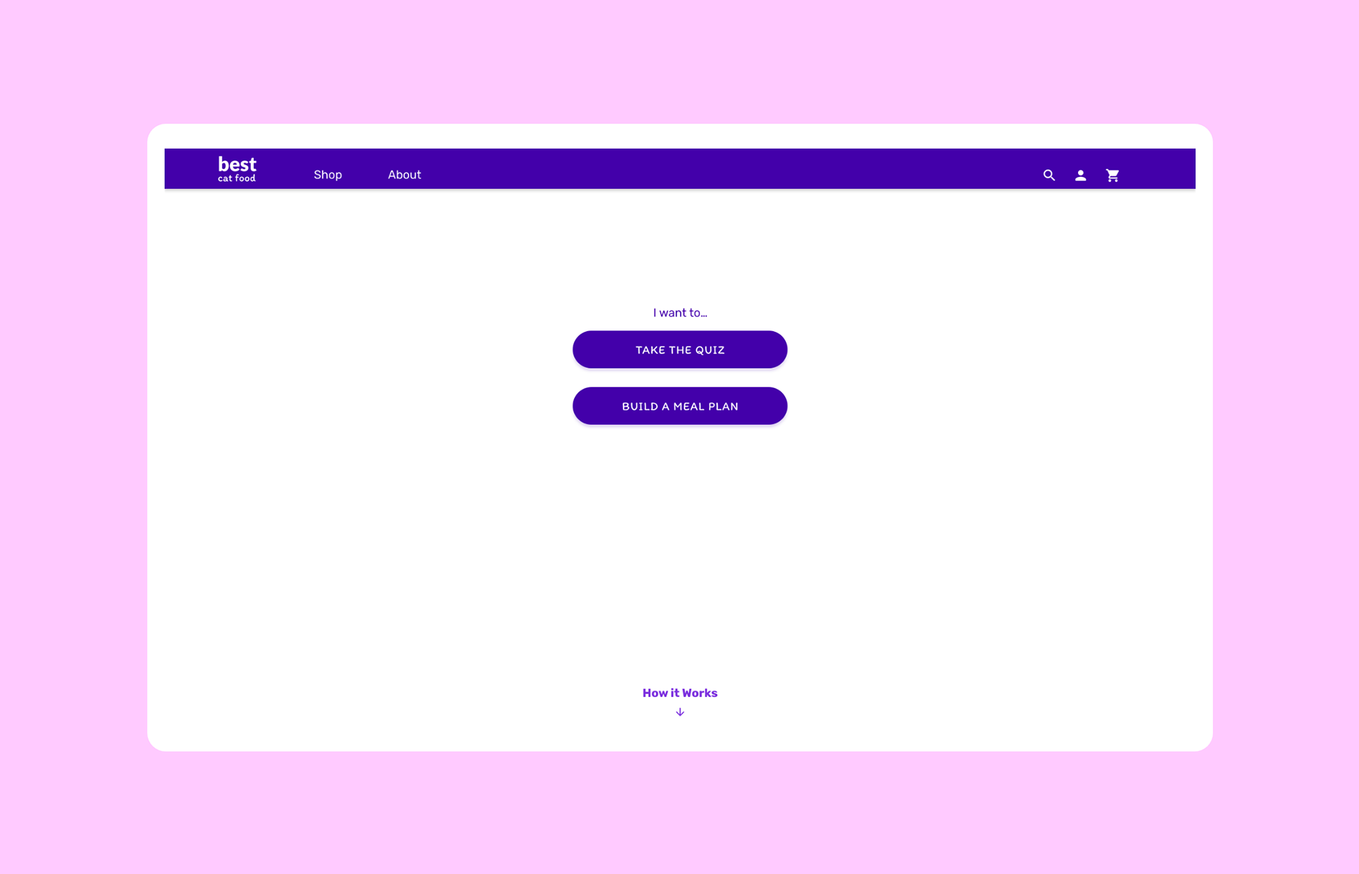
Quiz or Meal Plan
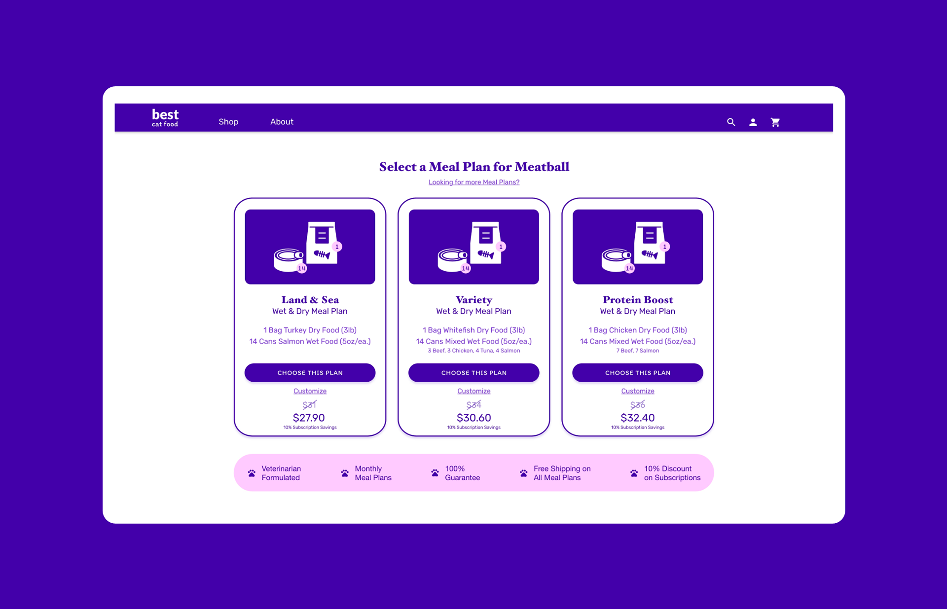
Meal Plan Select
Protein Preference
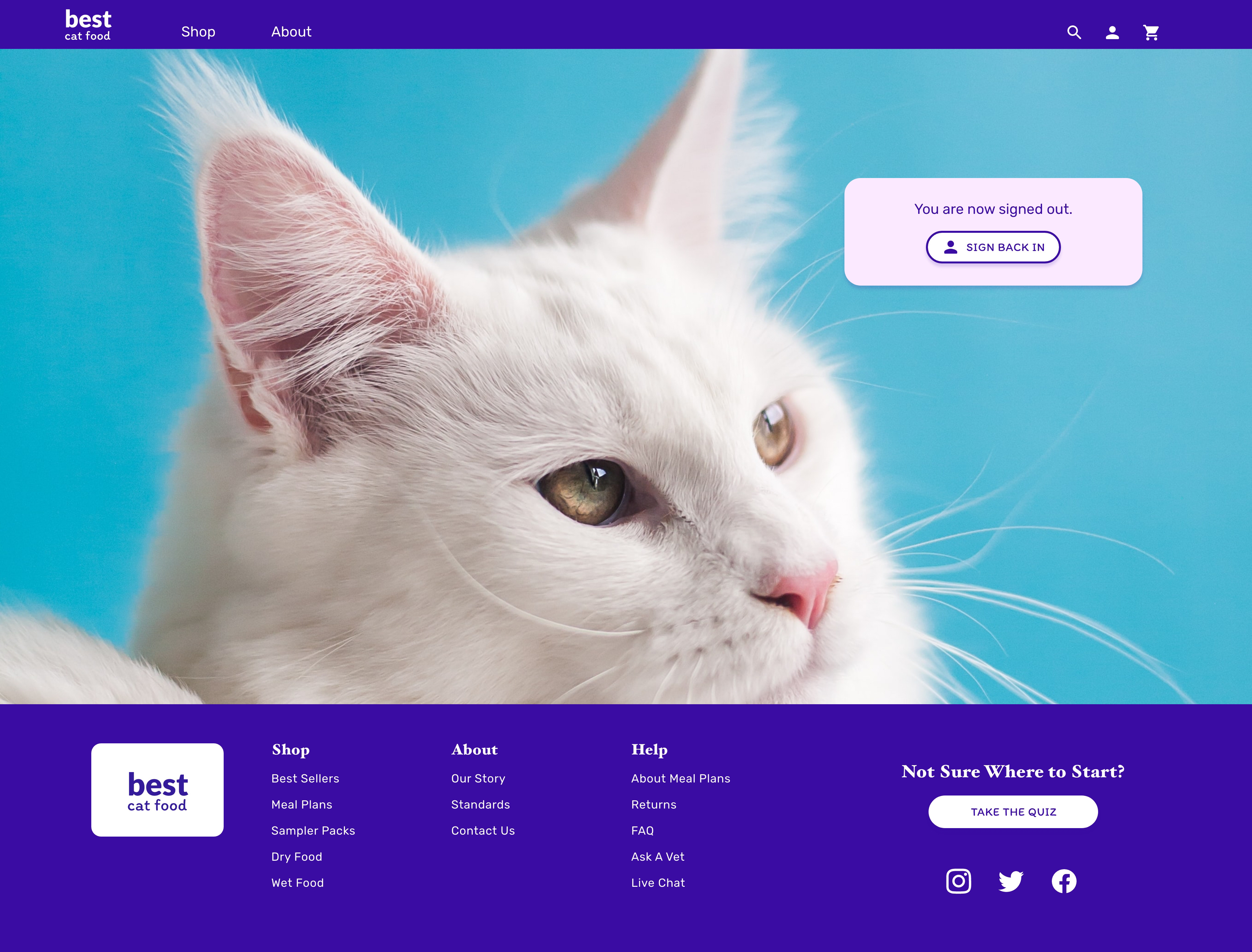
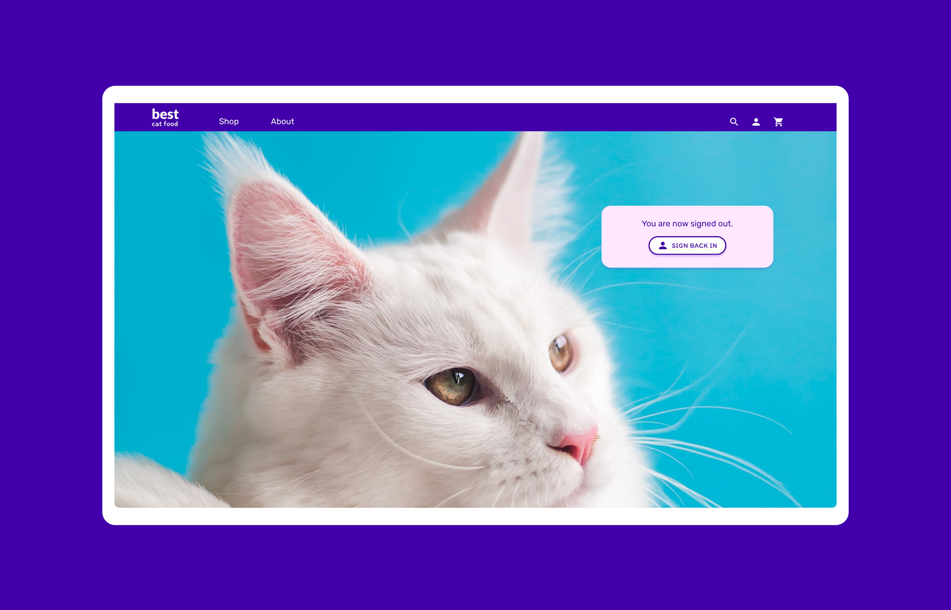
Sign Out
Understanding the User
Getting Started
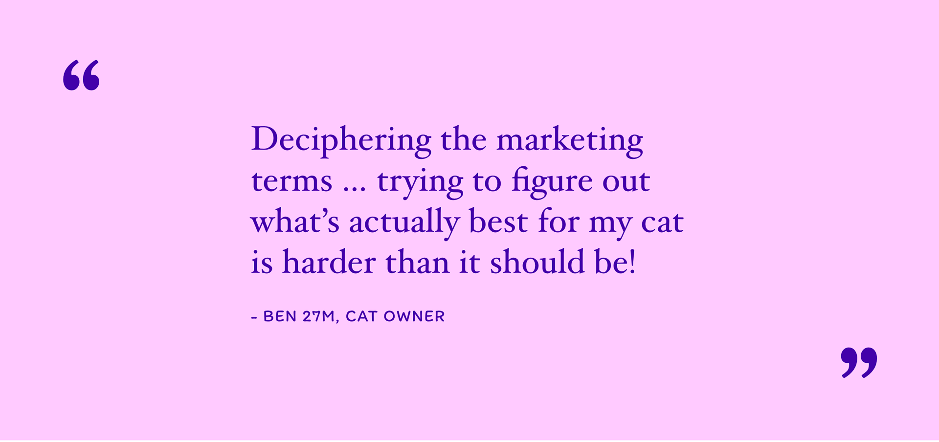
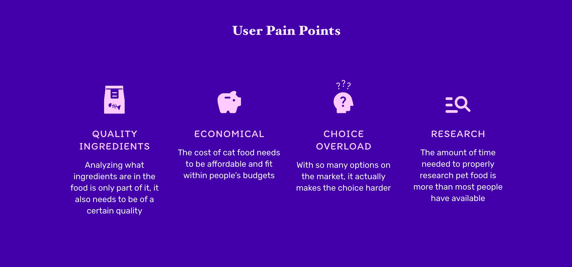
Let's talk about that overwhelming feeling you get when you start shopping for something. You walk into a store, or you open a browser window, and you start the quest. But how do you decide which product is the best? Packaging? Marketing? The price? Talk about decision paralysis. This is where I found myself pouring through hundreds of reviews of hundreds of cat foods. It was endless. It started to make me angry, honestly. Why isn't this process easier?
User Research
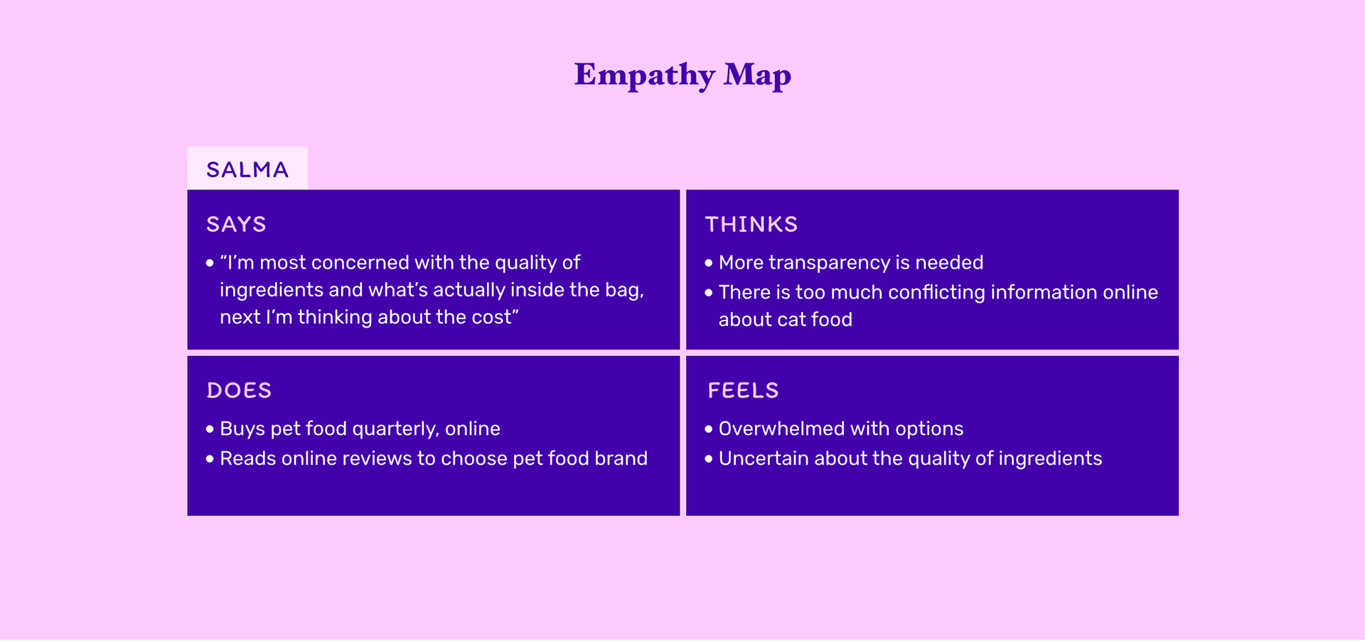
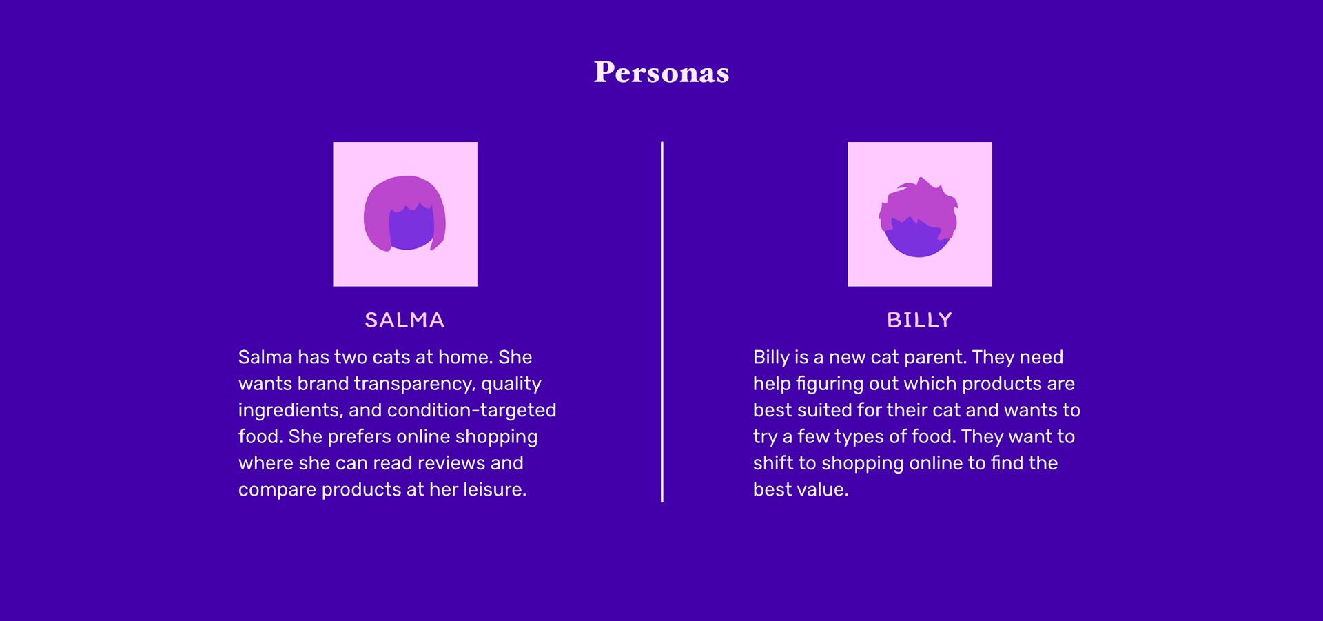
I set up interviews with a few pet owners to see if others had experienced the same pain I had when selecting pet food. Turns out, we've all been there. Everyone reported feeling lost or duped at one time or another. Most people searched the internet for reviews, some asked friends or vets, one user resorted to random selection! There has to be a better way.
What's impeding people from sourcing the right food for their cats?
Finding the Target Audience
To get a better handle on the users, I sorted interview responses into empathy maps and then aggregated those into separate user bases. This ultimately showed me there were a couple unique users: those seeking convenience with a conscience, and those seeking the best value. Some participants preferred shopping online, some preferred in person, but all reported a willingness to try a subscription based model if it solved all their headaches.
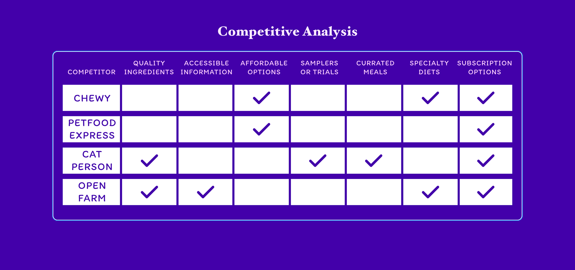
Once the user base was solid, I compared what was already on the market to look for gaps and opportunities. It was surprising with how far off most of the market is from providing solutions to the problems users were facing. None of the competitors checked all the boxes, which meant this problem was ripe for solving.
Starting the Design
Wireframing
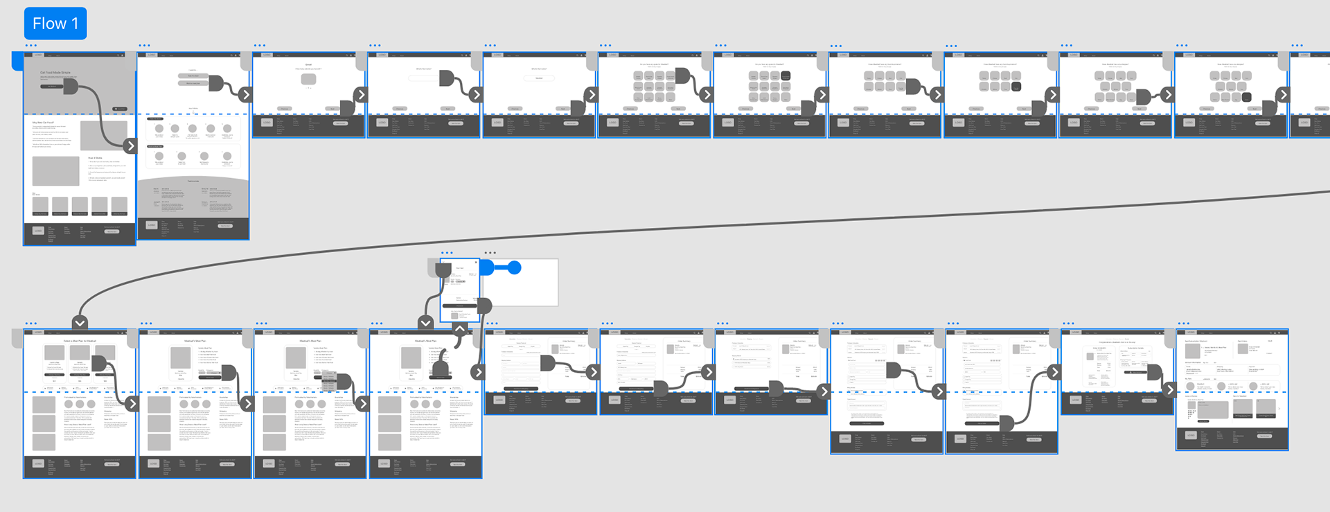
It was time to start figuring out how Best Cat Food would look and how the information would be laid out within the site. This process began with drawing the sitemap to determine which screens needed to be designed, according to the user journey. Next, I started sketching wireframes. Each went through a few rounds of refinement, and then ultimately got rebuilt digitally in Adobe XD.
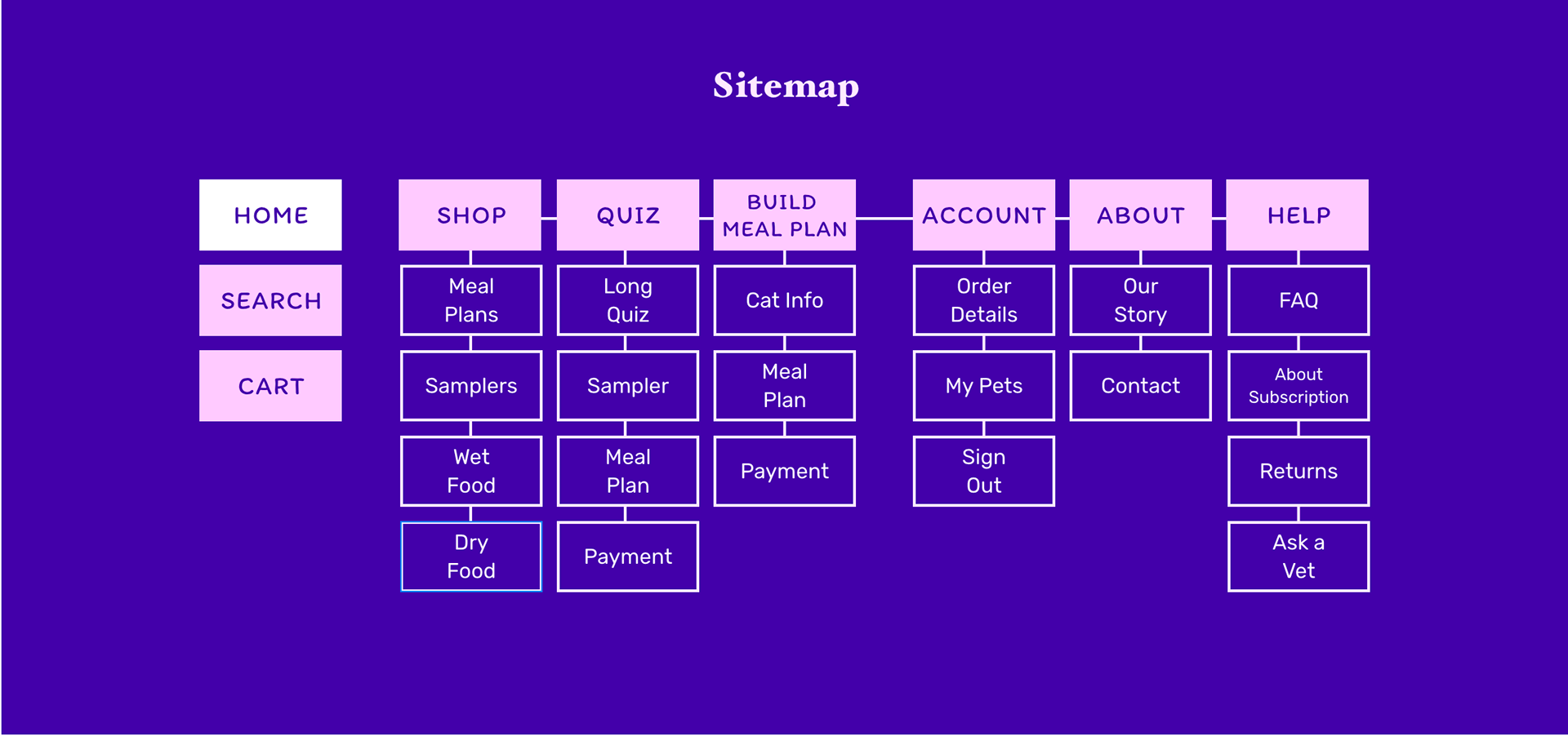
Sitemap
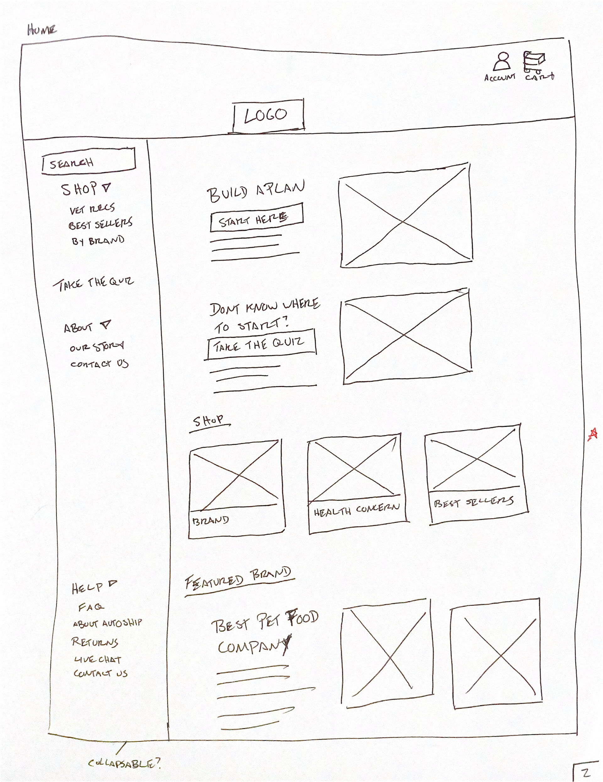
Wireframe Sketch - Home
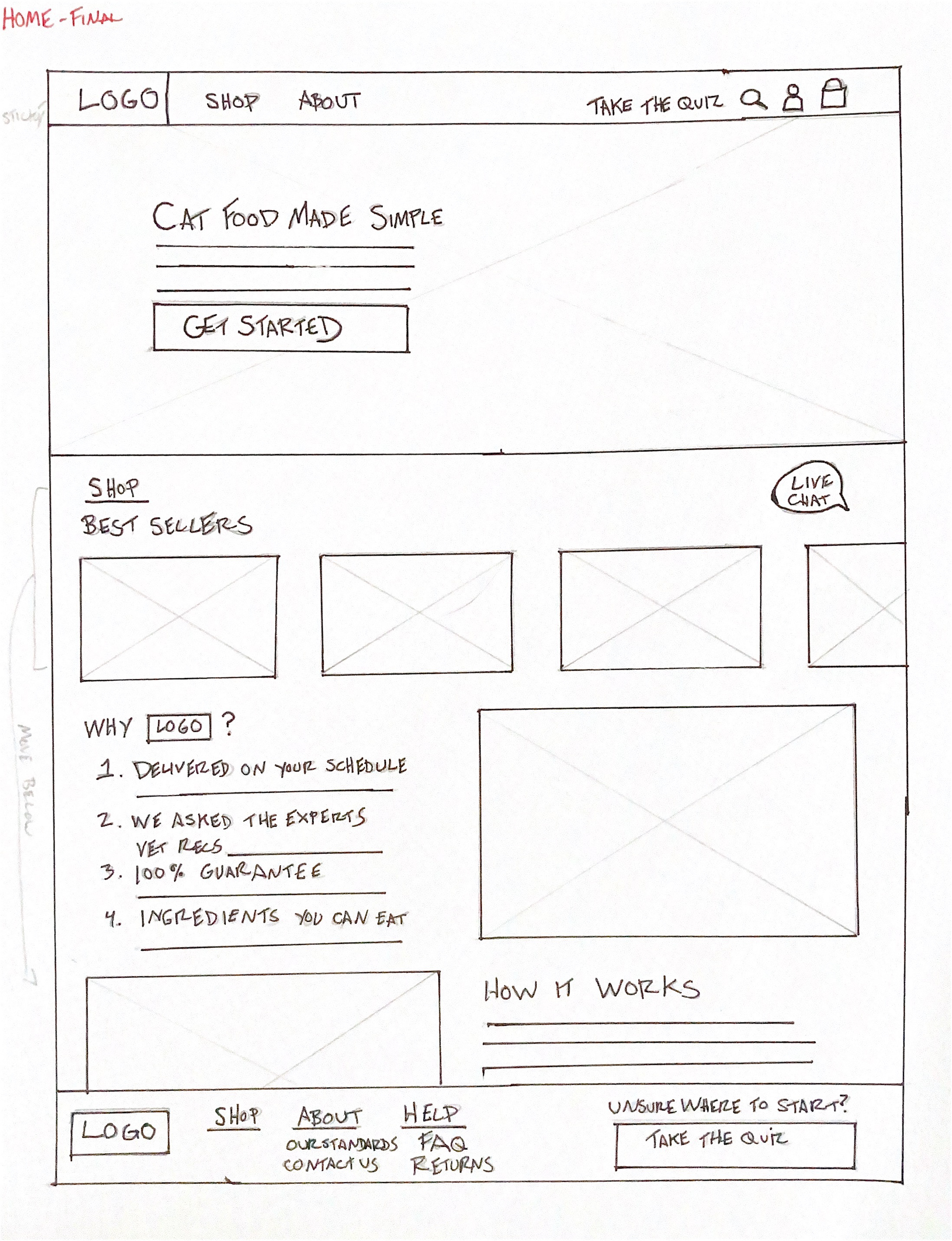
Refined Wireframe Sketch - Home
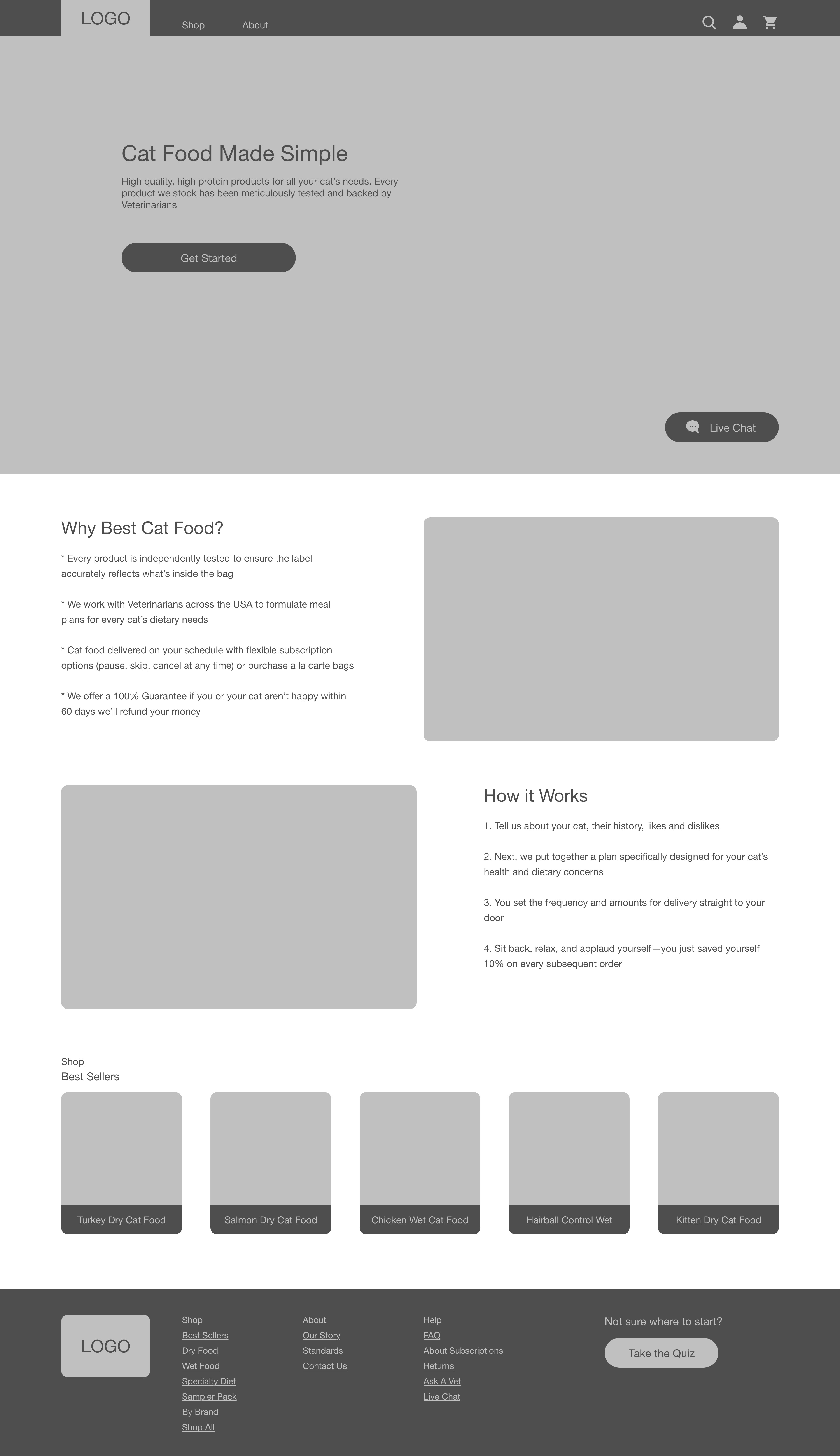
Home
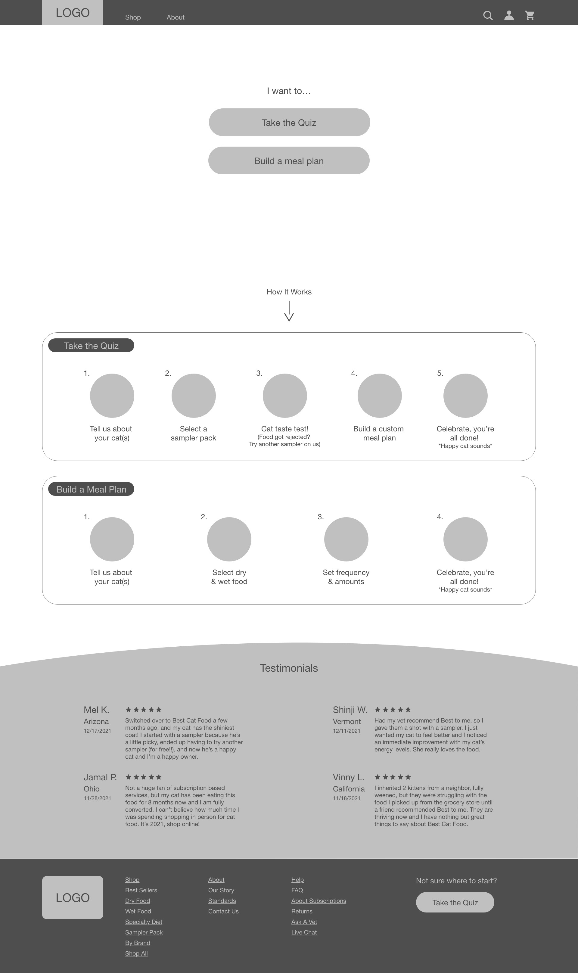
Quiz or Meal Plan
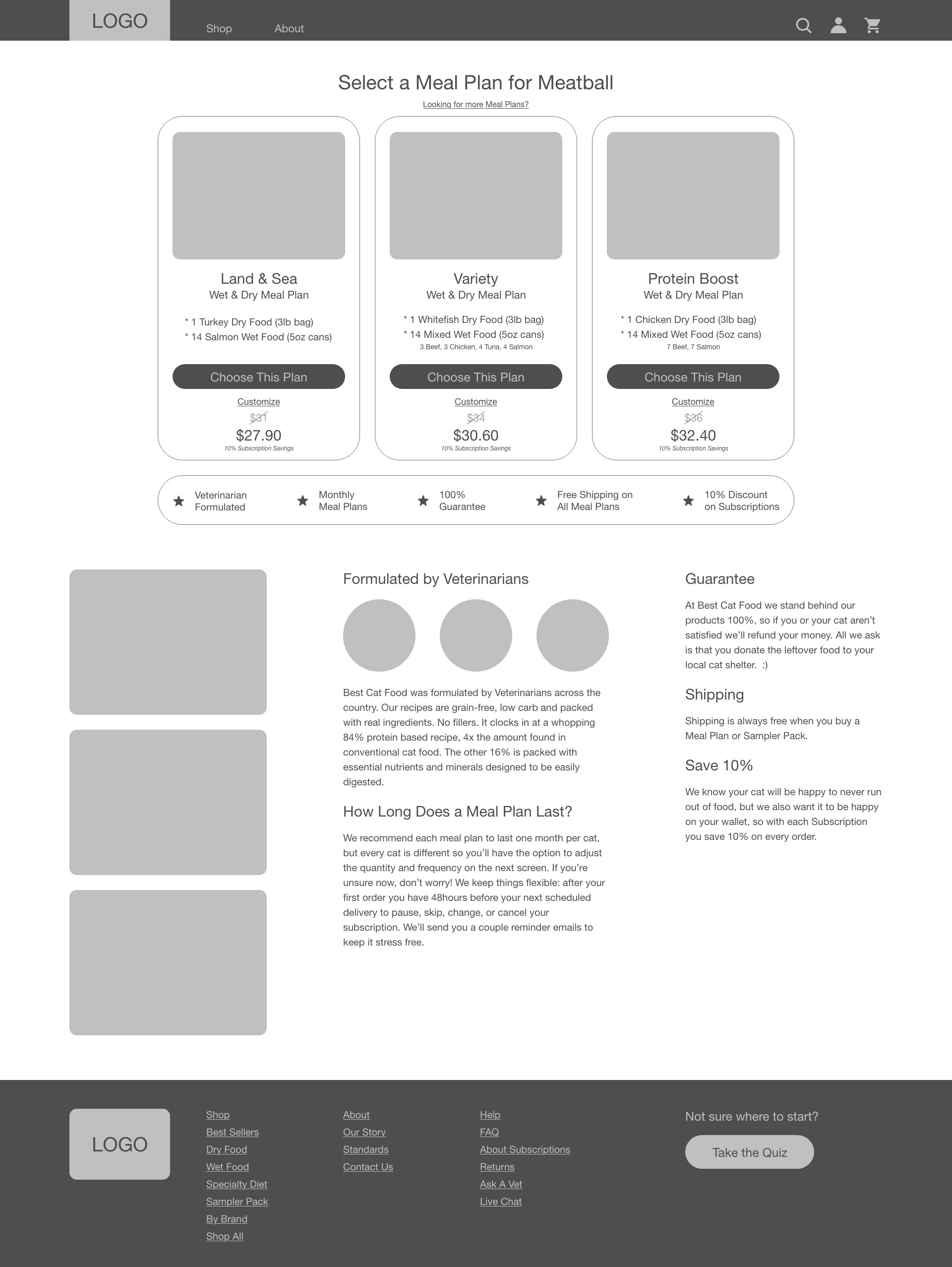
Meal Plan Select
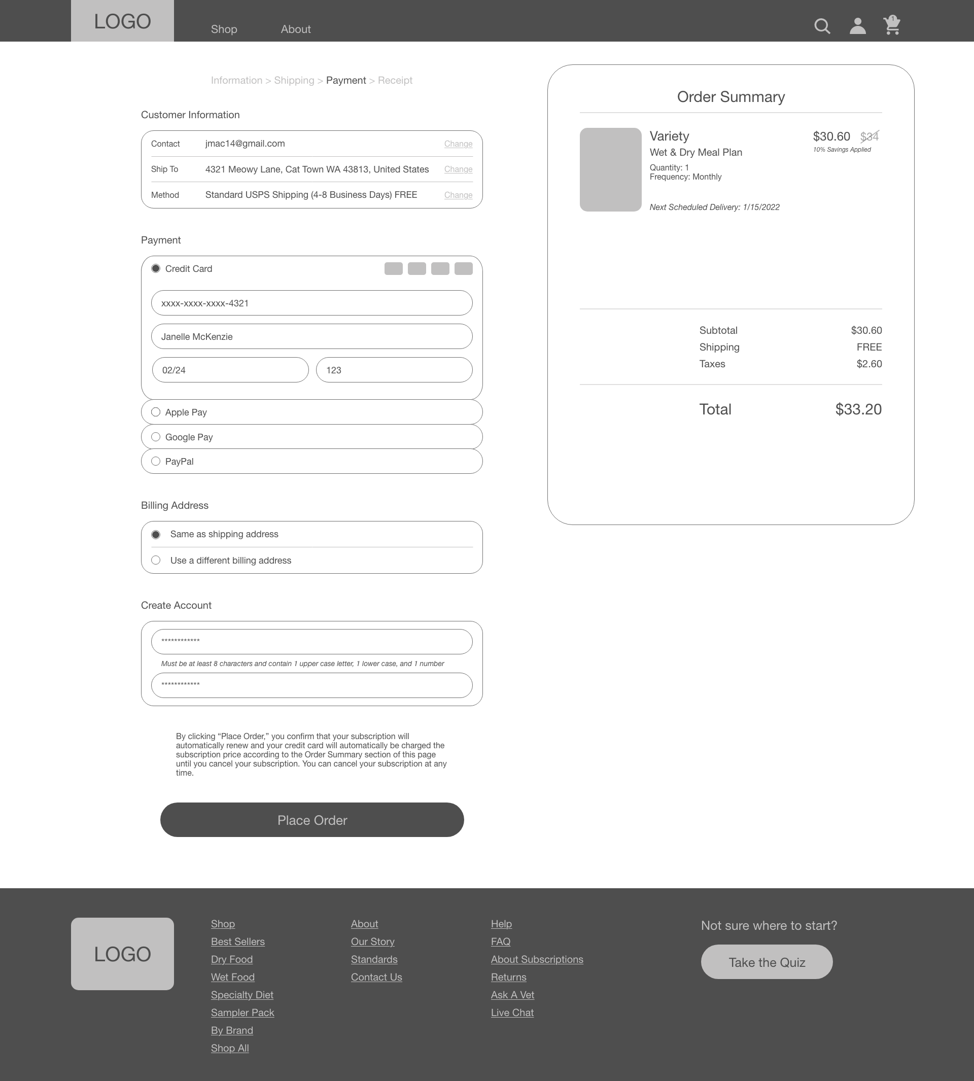
Payment
Low-Fidelity Prototype
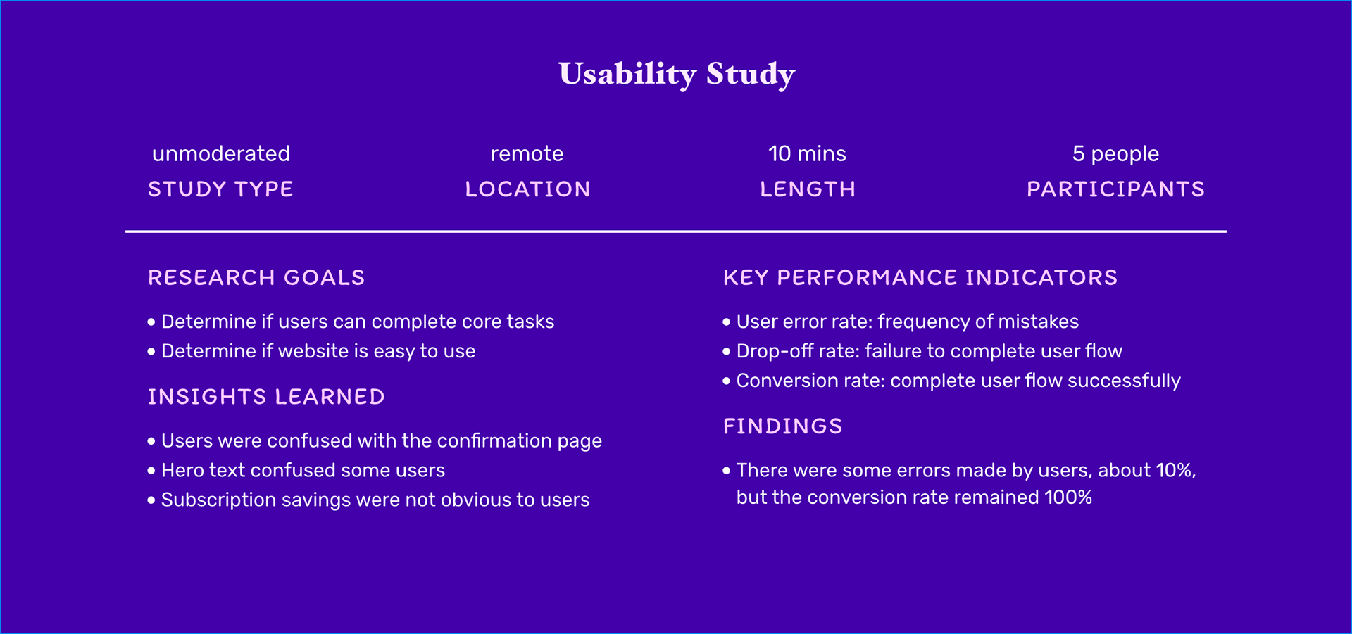
UX Research Study
Once the low-fidelity prototype was ready, it was time to put it to the test. The primary goals of the ux research study was to determine if the website was effective at simplifying the process of researching brands and buying cat food. All the users completed the user flow, but there were a few mistakes along the way. I used those insights to redesign the wireframes before moving into high-fidelity mockups.
Designing the Brand
Early on there was a goal to make Best Cat Food trustworthy and transparent. It also needed to have an element of playfulness, otherwise users might struggle to connect with the brand. With those goals in mind, I selected a color palette and got to work on designing the components piece by piece.
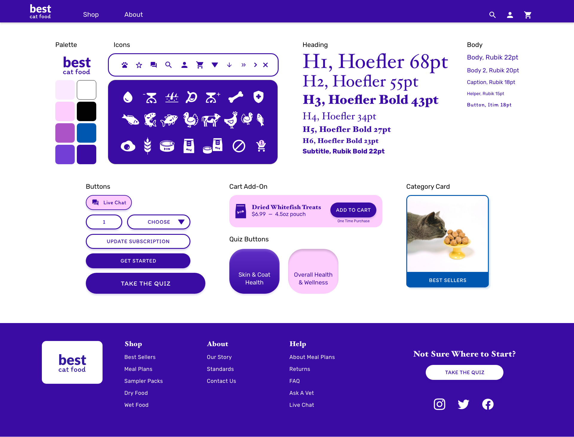
Design System
Final Mockups
Call to Action
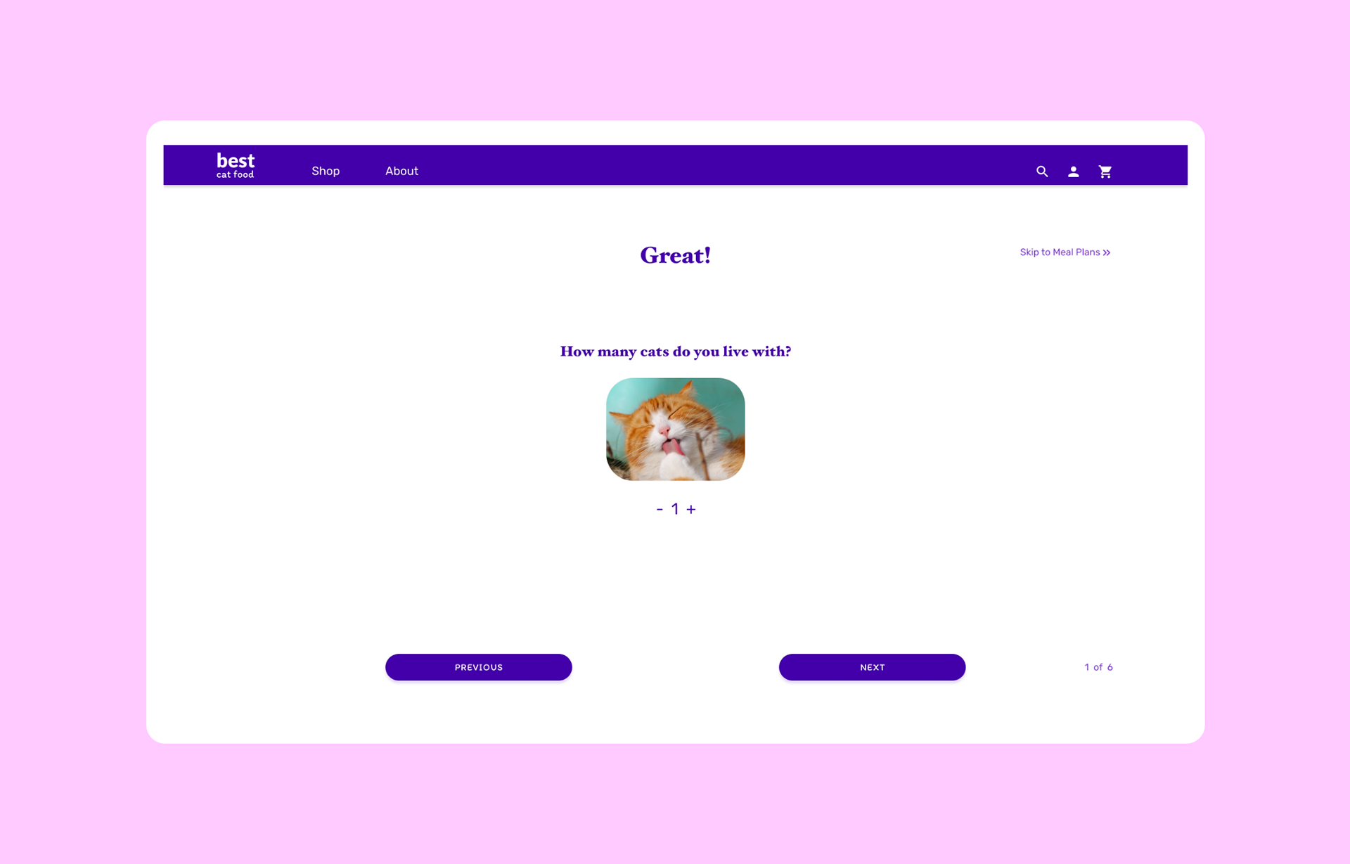
How Many Cats
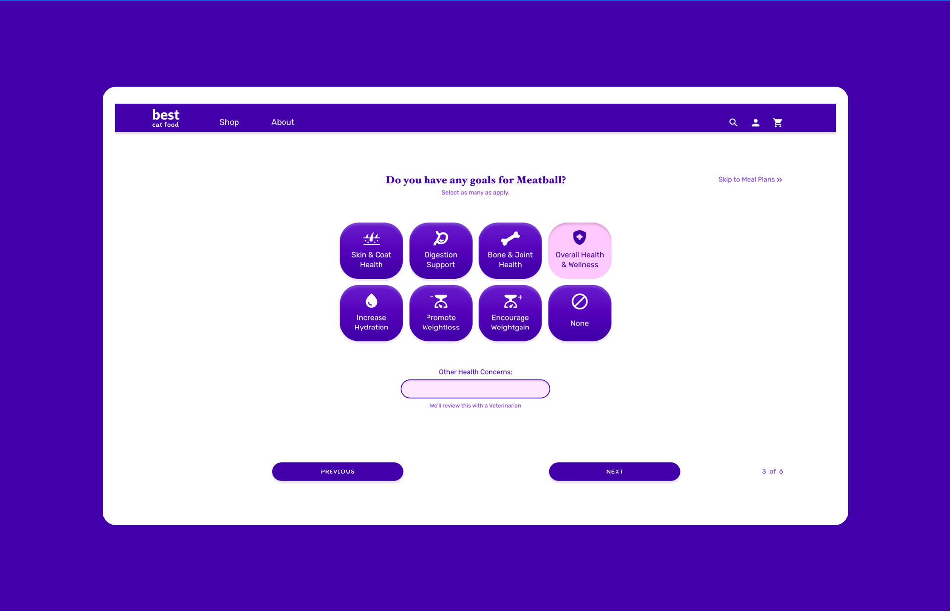
Goals
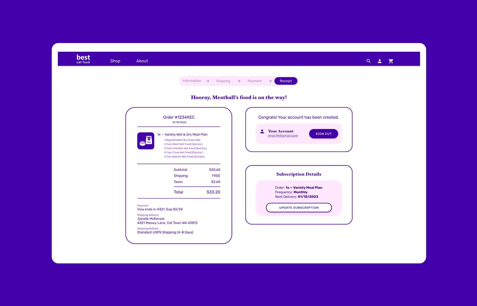
Receipt
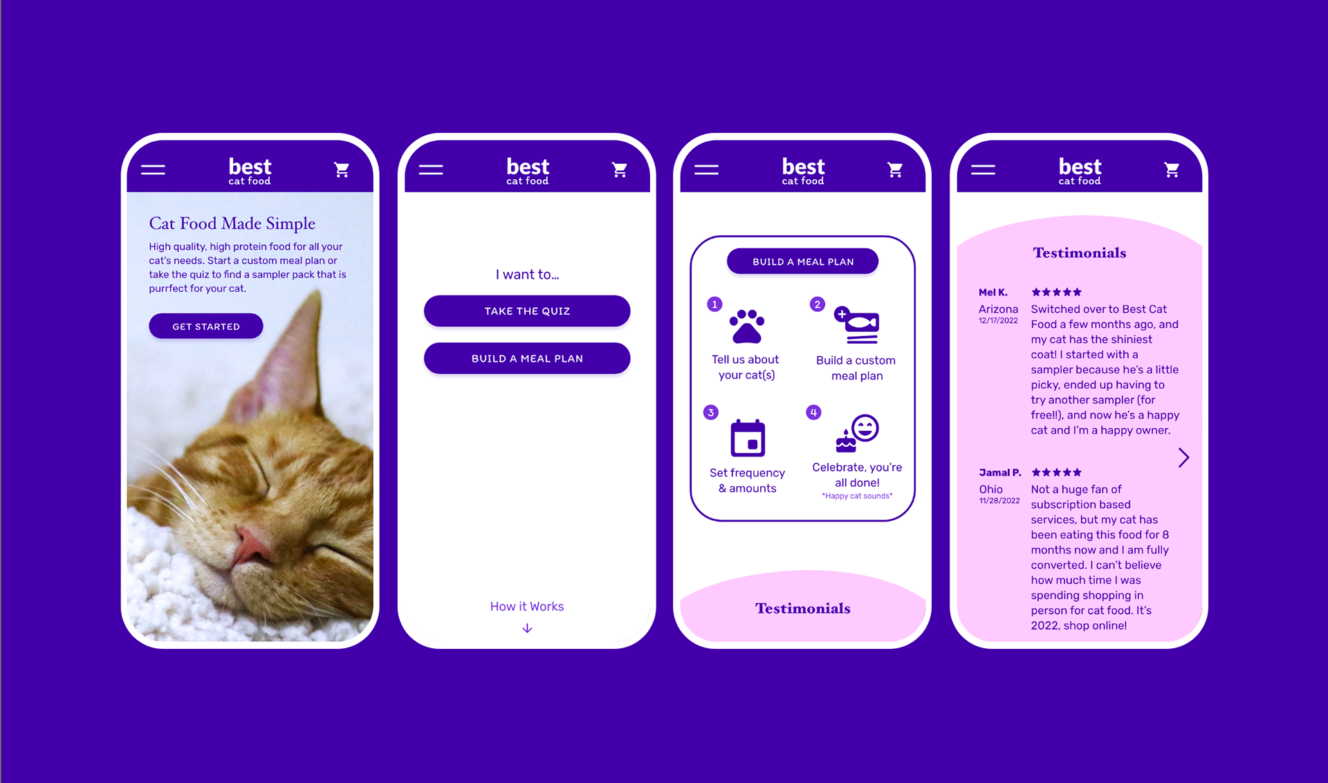
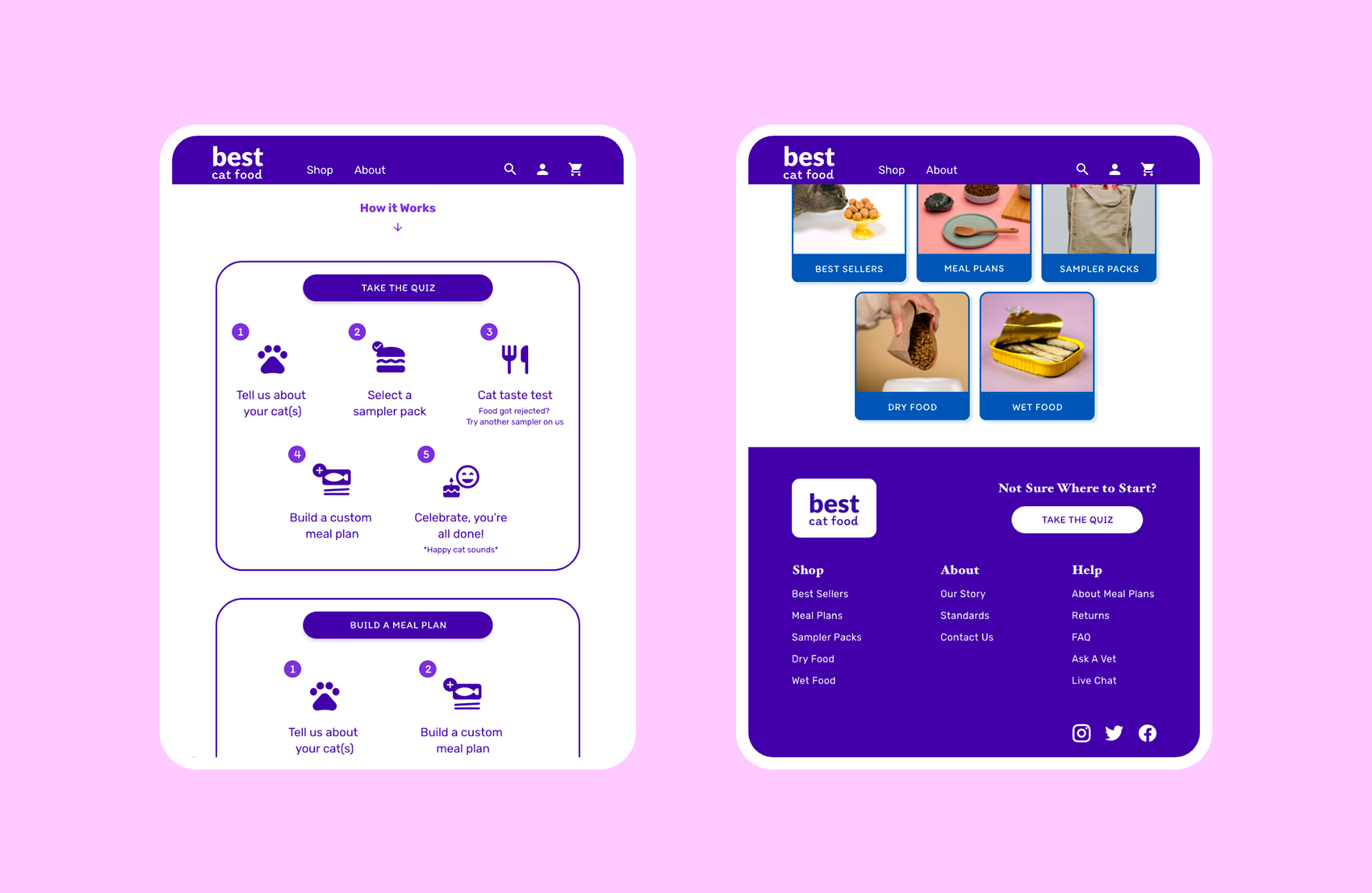
Additional Screen Sizes
Final Prototype